The kitchen, often called the heart of the home, deserves more than just functional consideration—it warrants thoughtful color selection that can transform the entire space.
Whether you’re planning a complete renovation or simply refreshing your existing kitchen, the right color palette can dramatically alter the mood, perceived spaciousness, and overall appeal of your culinary haven.
This comprehensive guide explores 21 inspiring kitchen color ideas that blend timeless appeal with contemporary flair, helping you create a stylish and modern makeover that truely reflects your personal taste.
According to a 2024 survey by the National Kitchen and Bath Association, homeowners spend an average of 4.5 hours daily in their kitchens, making it essential that the space feels inviting and energizing.
“Color is the simplest way to transform a kitchen’s identity without altering its footprint,” explains interior designer Maria Chen.
“It’s the most impactful design decision with the greatest return on investment for your emotional connection to the space.”
Understanding Color Psychology for Kitchens
Before diving into specific color ideas, it’s worth considering how different hues affect our cooking and dining experiences. Colors don’t just influence aesthetics they shape our mood, appetite, and even social dynamics in the kitchen environment.
Research from the Color Psychology Institute suggests that warm colors like reds and yellows can stimulate appetite and conversation, making them ideal for social kitchens. Cooler tones such as blues and greens tend to suppress appetite but promote calmness and clarity perfect for mindful eating and focused cooking.
Interior architect James Wilson notes, “The kitchen isn’t just where we prepare food; it’s where we gather, connect, and create memories. The colors you choose should support these activities and resonate with your lifestyle.”
With this understanding in mind, let’s explore our curated selection of kitchen color ideas designed to inspire your next makeover.
I. Timeless Neutral Foundations
1. Sophisticated Greyscale Gradients
Grey has evolved from a trendy choice to a modern classic in kitchen design. What makes today’s grey kitchens special isn’t just the use of a single shade but the thoughtful layering of multiple grey tones to create depth and sophistication.
A multi-tonal grey kitchen can incorporate charcoal lower cabinets, medium grey upper cabinets, and light grey walls to create a natural sense of dimension. This approach prevents the flat, one-dimensional look that can sometimes make grey kitchens feel cold or institutional.
“The key to a successful grey kitchen is contrast and texture,” suggests kitchen designer Elena Markos. “Incorporate at least three different grey values and add metallic accents—brushed nickel, chrome, or brass hardware creates reflective points that bring the space to life.”
Real-world success stories abound, like the award-winning Grayson Kitchen in Portland, which uses seven distinct grey tones alongside white marble countertops and brushed brass fixtures to create a space that feels simultaneously cohesive and dynamic.
2. Warm Taupe and Beige for Enduring Appeal
While cool greys dominated kitchens for many years, warmer neutrals like taupe and beige have resurged with sophisticated new interpretations. These earth-inspired neutrals create an instantly welcoming atmosphere that feels both timeless and current.
Beiges and taupes excel when paired with natural materials that enhance their inherent warmth. Consider:
- Honey-toned wood accents for a harmonious, organic feel
- Creamy marble countertops with caramel veining for elegant coordination
- Terracotta or clay accessories that bring dimensional color play
Designer Sophie Rahman advises, “Don’t be afraid to introduce unexpected accent colors with warm neutrals. Deep teals, muted plums, or even burnt orange elements can elevate a beige kitchen from pleasant to positively stunning.”
To create visual interest in a neutral kitchen, vary textures significantly—textured tile backsplashes, mixed metal fixtures, and natural fiber elements prevent the space from feeling flat despite its cohesive color scheme.
3. Classic All-White Kitchens with a Twist
The all-white kitchen remains perennially popular, but today’s interpretations add nuance and dimension to prevent the clinical feel that can plague this classic choice. Modern white kitchens incorporate subtle variations in white tones and significant textural differences to create spaces that feel clean yet warm.
Designer Jackson Mills recommends, “Instead of flat white everything, choose cabinets with visible grain, walls with slight texture, and perhaps countertops with gentle veining. The eye perceives these as ‘white’ while the brain registers the subtle variations that make the space feel rich and layered.”
For maintenance concerns that often accompany white kitchens, new technologies offer practical solutions. Performance fabrics, scuff-resistant cabinet finishes, and engineered surfaces with superior stain resistance make white kitchens more livable than ever before.
A standout example is the Whitman Kitchen in Chicago, which combines bright white upper cabinets with slightly creamy lower cabinets, marble-look quartz with gentle grey veining, and a herringbone backsplash in varying white tones. The result feels cohesive yet visually rich—white without blandness.
II. Bold Statement Colors
4. Navy Blue for Sophisticated Depth
Navy blue has emerged as the “new neutral” that carries dramatic impact while maintaining broad appeal. This versatile hue brings instinctive associations with dependability, authority, and tranquility—perfect for creating kitchens that feel both impressive and serene.
Application strategies vary depending on your commitment level:
- Lower cabinets in navy with white uppers create balance while grounding the space
- All-navy cabinets with light countertops offer dramatic contrast
- Navy island with neutral perimeter cabinets provides a focal point without overwhelming
“Navy works exceptionally well because it behaves almost like a neutral while still offering color impact,” explains color consultant Daria Chen. “It pairs beautifully with brass, wood, marble, and concrete—materials found in most kitchens.”
Lighting considerations become crucial with navy elements. Ensure ample task lighting under cabinets and consider slightly increasing the overall lighting level to prevent the space from feeling too dark. Natural light particularly complements navy, bringing out its rich undertones.
5. Emerald Green for Natural Elegance
Emerald green kitchens have surged in popularity as homeowners embrace biophilic design—the integration of nature-connected elements that improve wellbeing. Research from the Human Spaces Report shows that environments incorporating natural elements like green can increase wellbeing by 15% and creativity by 15%.
This rich, jewel-toned green works best in kitchens with abundant natural light, which highlights its depth and complexity. For north-facing kitchens with cooler light, consider slightly warmer green tones with yellow undertones to prevent the space from feeling cold.
Designer Lauren Taylor’s award-winning Green Hills Kitchen demonstrates emerald’s versatility—featuring green cabinetry paired with unlacquered brass hardware, white oak accents, and honed black granite countertops. “The key was balancing the bold color with plenty of natural materials that echo what we find in nature,” Taylor notes. “Green doesn’t exist in isolation outdoors—it’s always accompanied by browns, blacks, and warm sunlight.”
6. Dramatic Charcoal and Black Accents
Black and charcoal elements bring architectural definition and sophistication to kitchens, creating focal points that anchor the entire design. Rather than overwhelming the space, thoughtfully placed dark elements actually enhance other colors and materials.
Strategic applications include:
- Black-framed glass cabinet fronts that showcase colorful dishware
- Charcoal islands that ground an otherwise light kitchen
- Matte black range hoods that create a stunning focal point
- Dark countertops paired with lighter cabinets for classic contrast
“The mistake people make with dark elements is using them timidly,” cautions architect Ramon Dias. “A single black cabinet in an otherwise white kitchen looks like an afterthought. Commit to your dark elements by repeating them thoughtfully throughout the space—perhaps in your fixtures, some hardware, and a major component like an island.”
To balance dark elements, ensure adequate lighting—both natural and artificial. Under-cabinet lighting, pendant clusters, and well-placed recessed lights prevent dark surfaces from absorbing too much light and making the space feel smaller.
Read This Blog: https://hometranquil.com/bedroom-decor/
7. Vibrant Red Touches for Energy
Red has powerful psychological and cultural associations that make it particularly impactful in kitchens. Across many cultures, red symbolizes fortune, celebration, and passion—while physiologically, it’s proven to stimulate appetite and energize conversations.
Rather than overwhelming the space with red everywhere, strategic touches create maximum impact:
- A glossy red range as the kitchen’s centerpiece
- Red lower cabinets with neutral uppers for grounding energy
- A red tile backsplash that creates a focal wall
- Red pendant lights or stools for easily changeable accents
“Red works best when it has room to breathe,” advises color psychologist Dr. Miranda Jones. “Surround it with plenty of neutral space—whites, greys, or natural wood tones that allow the red elements to shine without competition.”
For kitchens that open to other living spaces, consider how the red elements will transition to adjacent rooms. Using small red accents in connecting spaces creates cohesion without requiring the same color intensity throughout the home.
III. Soft & Refreshing Palettes
8. Pastel Blue for Airy Tranquility
Pale blue tones create an illusion of expanded space while imparting a sense of tranquility that’s particularly valuable in the kitchen. Research from the Color Association of the United States indicates that soft blues can lower blood pressure and heart rate—beneficial qualities in what can be a high-stress environment.
In smaller kitchens, pastel blue cabinets paired with white countertops and backsplashes create an airy, expansive feel. The color recedes visually, making compact spaces feel more generous. For larger kitchens, this same quality prevents the space from feeling cavernous or cold.
“Pastel blue kitchens benefit from textural elements that add depth without compromising the light feel,” recommends designer Sophia Chen. “Consider embossed cabinet fronts, textured tile backsplashes, or natural fiber elements like rattan pendant lights or wooden accessories.”
One advantage of pastel blue is its seasonal adaptability—it feels crisp and refreshing in summer months while evoking icy serenity in winter. Seasonal accessories in complementary colors can shift the mood subtly throughout the year.
9. Soft Mint and Sage Green Influences
Soft, desaturated greens like mint and sage have emerged as leading choices for health-conscious, nature-connected homes. These gentle green hues bring associations with herbs, plants, and natural wellness—perfect for spaces dedicated to nourishment.
According to the 2024 Wellness Kitchen Report, 78% of homeowners now prioritize designs that promote physical and mental wellbeing, with nature-inspired colors ranking among their top strategies. Sage green, in particular, bridges traditional and contemporary aesthetics, making it versatile for various kitchen styles.
For application, consider:
- All-over sage cabinetry with warm wood countertops for a garden-inspired feel
- Mint green islands or lower cabinets with white uppers for a lighter approach
- Sage green walls with white cabinets for a subtle, adaptable option
“These gentle greens pair beautifully with warm woods like oak and walnut,” notes materials specialist Jason Cooper. “The combination feels immediately organic and balanced—like something you’d find in nature.”
10. Subtle Pink Undertones for Warmth
Pink has transcended gender associations to become a sophisticated neutral with unique warming properties. Subtle blush tones with grey or beige undertones—sometimes called “greige-pink” or “dusty rose”—add unexpected warmth without feeling overly sweet or feminine.
These complex pinks create particularly welcoming environments for morning routines, as they mimic the flattering light of sunrise and complement skin tones beautifully. When paired with concrete countertops, black fixtures, or dark woods, these subtle pinks take on an architectural quality that reads as neutral but with more character.
Designer Alicia Ramirez observes, “The key to sophisticated pink kitchens is balancing the softness with structure. Incorporate strong geometric patterns in backsplashes, squared-off cabinet profiles, or architectural lighting to provide counterpoint to the color’s inherent softness.”
A standout example is the award-winning Rosewood Kitchen in Seattle, which pairs dusty rose lower cabinets with charcoal upper cabinets, honed soapstone countertops, and brushed brass fixtures. The result feels simultaneously warm and grounded—clearly contemporary without being cold.
11. Butter Yellow for Cheerful Ambiance
Yellow has strong psychological associations with optimism, clarity, and energy—making it particularly suitable for kitchens used primarily in morning hours. Research from the Color Psychology Association indicates that yellow environments can improve information processing and creative thinking—helpful qualities for meal planning and preparation.
However, yellow requires careful handling. Design psychologist Dr. Lauren Williams advises, “Full-strength yellow can be overwhelming in large doses. Consider butter yellow or chamomile tones that incorporate slight grey or cream undertones for sophistication.”
Application strategies differ based on kitchen size:
- In compact kitchens, yellow walls with white cabinets create sunny cheerfulness without constricting the space
- In larger kitchens, yellow cabinets or islands create a focal point while neutral perimeter elements provide visual rest
- For minimal commitment, yellow backsplashes or window treatments provide energy without permanence
To prevent yellow from overwhelming the space, ensure balance with grounding elements—medium-toned woods, soft whites, or gentle greens create harmony while allowing yellow’s natural cheerfulness to shine.
IV. High-Contrast Combinations
12. Dramatic Black and White Interplay
The high-contrast combination of black and white creates kitchens with architectural definition and timeless appeal. This classic pairing transcends trends while creating a perfect backdrop for changing accessories and personal touches.
Modern interpretations of black and white kitchens move beyond simple two-tone applications to create more sophisticated interplays:
- White upper cabinets with black lowers visually expand ceiling height
- Black-framed glass cabinet fronts against white walls create a greenhouse effect
- Heavily veined white marble with black cabinetry adds natural pattern to the contrast
- Black window frames and fixture accents punctuate primarily white kitchens
“The key to successful black and white kitchens is incorporating a third element that softens the starkness,” advises designer Michael Chen. “Consider natural wood open shelving, brass hardware, or textural elements like rattan or linen to add warmth and dimension.”
For maintenance considerations, new technologies have improved both black and white finishes. Fingerprint-resistant black cabinetry and stain-resistant white surfaces make this high-contrast pairing more practical than ever before.
13. Teal and Copper for Unexpected Luxury
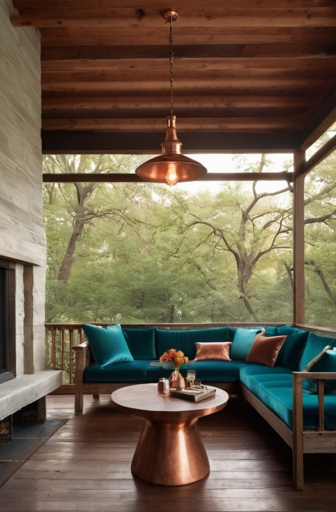
The combination of teal (a blue-green jewel tone) with copper metallics creates unexpected luxury through color theory principles. These colors sit opposite each other on the color wheel, creating maximum visual impact when paired.
“Teal and copper work together because they’re complementary colors with similar intensity levels,” explains color theorist Dr. Hannah Rodriguez. “The warmth of copper perfectly balances the coolness of teal, while both share a rich, saturated quality.”
Application strategies for maximum impact include:
- Teal cabinetry with copper hardware and fixtures
- Copper range hoods or lighting against teal backsplashes
- Teal islands with copper counter stools or pendants above
This combination particularly benefits from thoughtful lighting design. “Copper reflects warm light beautifully,” notes lighting designer Thomas Wu. “Consider dimmable, warm-temperature lighting that enhances copper’s natural glow while preventing teal from appearing too dark in evening hours.”
14. Earthy Terracotta with Cream Accents
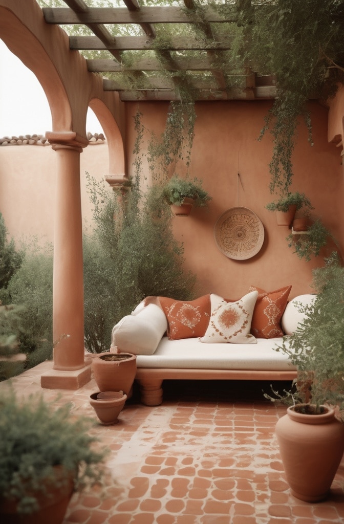
Terracotta and cream combinations evoke Mediterranean and global kitchens while feeling thoroughly contemporary. This pairing connects to ancient pottery traditions while creating spaces that feel grounded and timeless.
“Terracotta has deep cultural resonance across many traditions,” explains cultural design historian Dr. Maya Phillips. “From Italian farmhouses to Mexican haciendas to North African courtyards, this warm, earthy red-orange signifies hospitality and home cooking across centuries.”
The most successful terracotta kitchens incorporate:
- Textural elements that enhance the natural, handmade quality
- Multiple terracotta values from pale clay to deep rust
- Creamy whites that contain yellow undertones rather than stark whites
- Natural materials like wood, stone, and handmade ceramics
For seasonal adaptability, terracotta kitchens shine with changing accessories. Summer months might feature green plants and blue ceramics against the warm backdrop, while winter months welcome deep greens and browns for a cozier interpretation.
15. Forest Green and Brass for Timeless Elegance
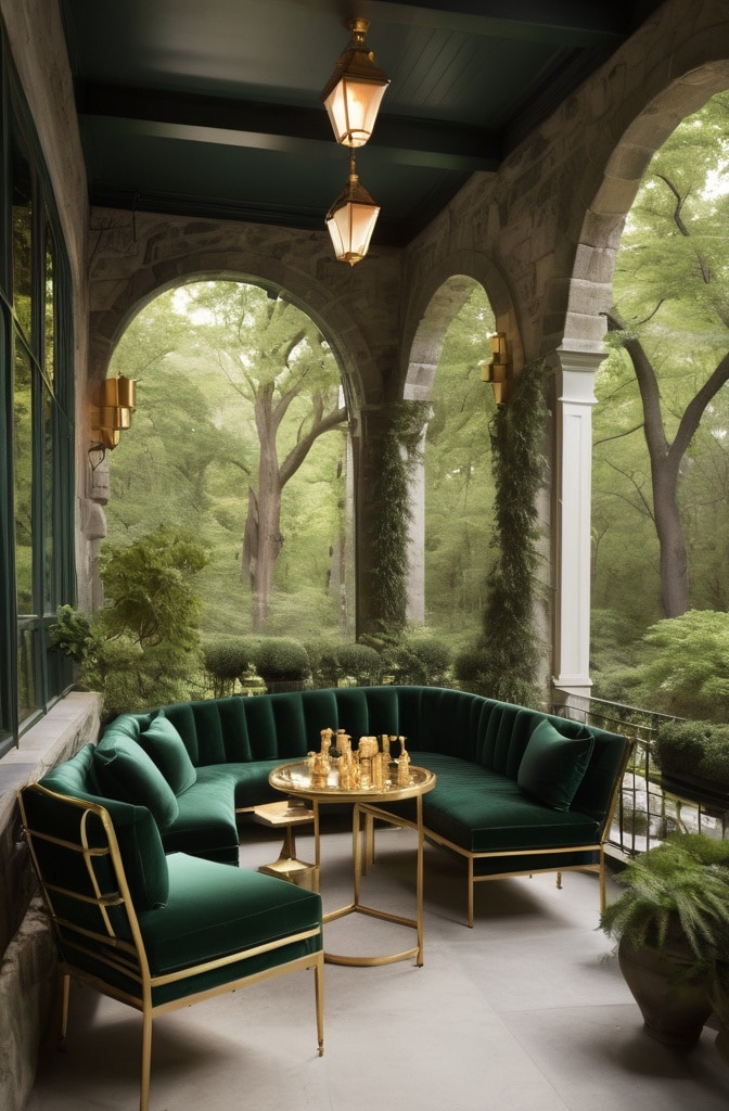
Forest green paired with brass elements creates kitchens with historical references and contemporary appeal. This combination draws from traditional libraries, historic institutions, and gentleman’s clubs while feeling fresh in today’s homes.
“Forest green has historical gravitas,” notes architectural historian Elena Park. “From 18th-century painted paneling to Victorian tile work, this deep green has signified permanence and quality for centuries. Paired with brass, it creates a sense of established luxury that new builds often lack.”
Application approaches vary by kitchen layout:
- Galley kitchens benefit from forest green lower cabinets with brass hardware and fixtures, keeping upper walls light for openness
- Open kitchens can handle all-over green cabinetry when adjacent spaces provide visual breathing room
- L-shaped kitchens might feature a forest green accent wall or range wall for focused impact
To balance the intrinsically dark nature of forest green, ensure adequate task lighting and consider lighter countertops that reflect available light upward into the space.
V. Nature-Inspired Color Stories
16. Olive and Oatmeal for Organic Harmony

The combination of olive greens with oatmeal neutrals creates kitchens with immediate organic appeal. These colors, drawn directly from nature, create spaces that feel inherently harmonious and balanced.
“These colors have existed together in landscapes for millennia,” explains biophilic designer Jordan Hartman. “Our brains register this combination as ‘natural’ because we’ve evolved seeing these colors together in the natural world.”
The most successful olive and oatmeal kitchens feature:
- Multiple olive tones from pale sage to deeper olive
- Textural oatmeal elements in varying weaves and finishes
- Natural stone with green undertones like soapstone or honed granite
- Minimal black accents for definition and contrast
Recent research from the Well Building Institute indicates that nature-connected color palettes can reduce stress levels by up to 60% compared to artificial color schemes—making these earthy combinations particularly valuable in high-stress environments like kitchens.
17. Aqua and Driftwood for Coastal Serenity
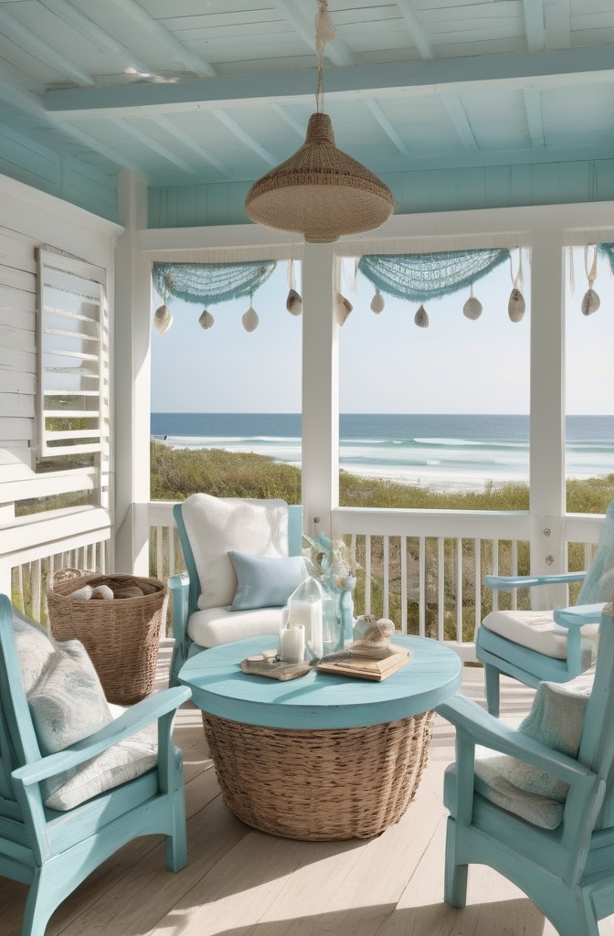
Aqua blue paired with weathered wood tones creates sophisticated coastal-inspired kitchens that transcend typical beach themes. This combination evokes water and shore without relying on literal coastal motifs or decorative clichés.
“The most successful coastal-inspired kitchens capture feeling rather than literal themes,” advises designer Caroline Shaw. “The goal is creating the sense of relaxation and connection you feel at the shore—not decorating with seashells and anchors.”
For open floor plans, this color story creates natural flow:
- Aqua kitchen elements can transition to deeper blues in dining areas
- Driftwood tones connect easily to most wood furniture in adjacent spaces
- The inherent lightness prevents visual heaviness in combined spaces
Seasonal adaptability comes naturally to this palette. Summer months might emphasize the aqua elements with glass and ceramics in similar tones, while winter months can introduce deeper blues and more prominent wood elements for a cozier feel.
18. Stone Grey with Natural Wood Integration
Stone grey paired with natural wood creates kitchens with architectural presence and organic warmth. This combination bridges contemporary and traditional approaches, working equally well in modern farmhouse, industrial, or minimalist contexts.
“Stone grey provides a perfect neutral backdrop that allows wood’s natural character to shine,” explains materials specialist David Chen. “Unlike white, which can create stark contrast, stone grey harmonizes with wood’s natural hues while still providing definition.”
The most successful implementations feature:
- Warm-undertoned greys that complement rather than cool wood tones
- Multiple wood elements with visible grain and character
- Minimal competing colors to maintain focus on the textural interplay
- Matte rather than glossy finishes for natural authenticity
A 2024 report from the Sustainable Kitchen Initiative found that kitchens featuring natural materials with minimal processing scored 40% higher on occupant satisfaction surveys—suggesting that the authentic natural qualities of stone and wood create inherently pleasing environments.
VI. Metallic and Statement Finishes
19. Copper and Bronze Accent Integration
Copper and bronze finishes have transcended trend status to become new classics in kitchen design. These living metals with their warm undertones add instant character and heritage quality to contemporary spaces.
Strategic placement maximizes their impact:
- Range hoods as metallic focal points against neutral backdrops
- Island pendant clusters that draw the eye and define gathering spaces
- Backsplash areas that catch and reflect light throughout the day
- Hardware that adds consistent warmth throughout the space
“The beauty of copper and bronze comes from their evolution over time,” explains metallurgist and designer Sandra Wu. “Unlike chromes and stainless, these living metals develop patina with use—telling the story of your kitchen’s life through subtle changes in finish.”
For maintenance considerations, most manufacturers now offer sealed options that maintain the initial finish if the evolving patina isn’t desired. Alternatively, various protective coatings allow homeowners to “freeze” the patina at their preferred stage of development.
20. Brushed Gold with Deep Tonals
Brushed gold paired with deep tonal colors creates kitchens with subtle luxury that avoids ostentation. Unlike the shiny brass of previous decades, today’s brushed gold has a sophisticated matte quality that integrates more subtly with contemporary spaces.
“Brushed gold reads as a neutral metallic,” explains designer Marcus Johnson. “It adds warmth without the flashiness of polished surfaces, making it perfect for elevating everyday spaces like kitchens.”
Particularly successful combinations include:
- Brushed gold fixtures against deep navy cabinetry
- Aubergine or plum kitchen islands with gold pendant lighting
- Forest green backsplashes with gold-framed open shelving
- Charcoal perimeter cabinets with gold hardware and fixtures
Lighting considerations become paramount with these combinations. “Ensure your lighting has a color temperature between 2700-3000K,” advises lighting specialist Elena Park. “Cooler lighting will drain the warmth from gold elements, while very warm lighting can make them appear brassy rather than gold.”
21. Silver and Chrome with Colorful Backdrops
While warm metals have dominated recent design trends, silver-toned metals paired with vibrant backdrops create distinctly contemporary kitchens with clean, crisp appeal. Chrome, stainless steel, and polished nickel add reflective brilliance that enhances colorful elements rather than competing with them.
“Silver-toned metals function almost like mirrors in the space,” explains designer Thomas Wu. “They visually expand colorful elements by reflecting them, creating a more dynamic environment.”
Application strategies vary by kitchen style:
- Modern kitchens benefit from large expanses of stainless against single bold colors
- Transitional spaces might feature chrome fixtures against colorful tile backsplashes
- Contemporary farmhouse kitchens can incorporate polished nickel against painted cabinet facades
To create visual hierarchy, consider varying the finish slightly across elements: perhaps brushed stainless appliances, polished chrome faucets, and satin nickel hardware. This subtle variation creates depth while maintaining the cohesive silver-toned theme.
Practical Implementation Guide
Transforming your kitchen with color needn’t require a complete renovation. Consider these budget-friendly approaches:
- Cabinet repainting offers dramatic transformation for 20-30% the cost of replacement
- Removable wallpaper on a focal wall creates impact without commitment
- Open shelving with colored dishware brings personality without structural changes
- Appliance panels in statement colors update the space while keeping functional elements
Before committing to major color changes, test extensively:
- Paint large poster boards rather than small swatches to understand true color impact
- View samples at different times of day to assess how lighting affects perception
- Consider how the colors look against existing elements that won’t be changed
- Test multiple options simultaneously for comparative assessment
For professional support, consider that full-service kitchen designers typically charge 10-20% of the project cost, while color consultants might charge $200-500 for targeted advice—a valuable investment to avoid costly mistakes.
Conclusion
The kitchen’s color story creates more than just visual appeal—it shapes how the space feels, functions, and connects with those who gather there. The 21 ideas presented offer starting points for creating kitchens that reflect both contemporary design sensibilities and timeless principles of color harmony.
When selecting your kitchen colors, prioritize your personal connection to the palette over fleeting trends. Consider how you use the space, when you typically gather there, and what feelings you hope to evoke during those moments. The most successful kitchens—regardless of their color scheme—reflect the people who use them while supporting their daily rituals and celebrations.
As kitchen designer Elena Markos reminds us, “The best kitchen isn’t the one that looks perfect in photographs but the one that feels perfect to its owners every day. Color is the most direct route to creating that emotional connection.”
Reader Resources
To further explore kitchen color options, consider these helpful tools:
- Visualizer apps from major paint manufacturers allow you to upload kitchen photos and test different colors
- Material libraries at kitchen showrooms offer hands-on experience with color combinations
- Color consultation services provide professional guidance for challenging spaces
- Design magazines feature real-world implementations that demonstrate how colors perform in actual homes
Remember that color exists not in isolation but in context—affected by your home’s natural light, surrounding spaces, and existing elements. Take time to consider these factors as you create a kitchen color story that feels both of-the-moment and timeless for your unique space.