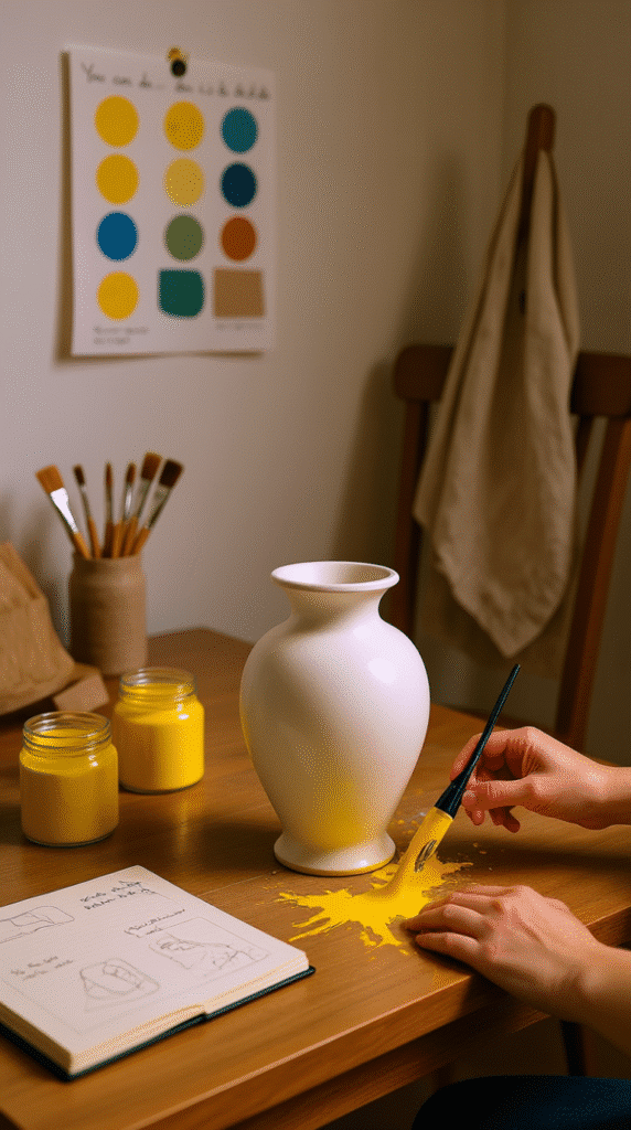
The Plain Beginning
It started with a vase so plain it could’ve been invisible.
White. Smooth. Ordinary.
The kind of vase you walk past in a store without even thinking twice.
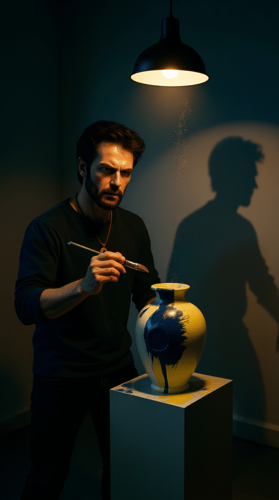
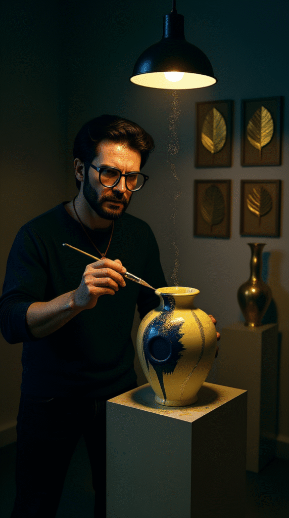
He placed it on the table, like a patient waiting for surgery.
Beside it—just three jars of paint.
Yellow. Navy blue. Gold leaf.
It didn’t look like much at first.
But that’s the thing about transformation—it rarely announces itself before it starts.
Why Yellow Was the First Bold Move
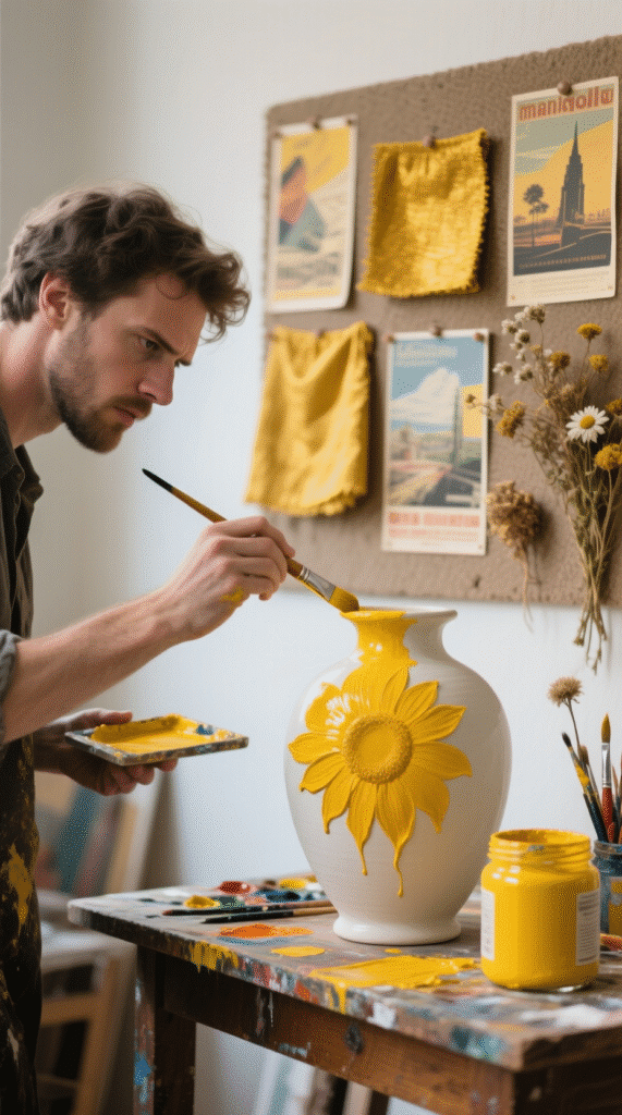
Yellow is not a shy color.
It doesn’t whisper in the background. It jumps right to the front and says, “Look at me.”
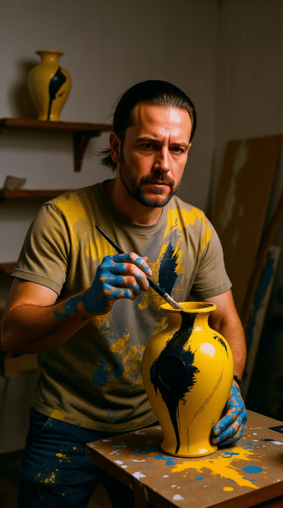
He didn’t paint it carefully.
The brush moved fast, splashing and swiping like he didn’t care if it was perfect.
That’s the secret—when you stop chasing perfection, things start looking alive.
The yellow covered random areas, not the whole vase.
It felt free, unpredictable—like a burst of laughter in a quiet room.
Letting Imperfection Do the Work
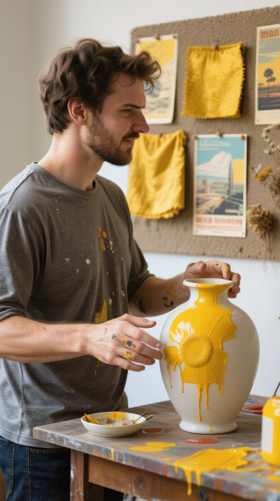
Most people try to make paint strokes smooth.
Not him.
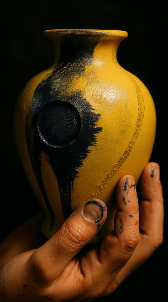
He left edges rough, streaks visible, tiny drips running down.
Instead of looking messy, it looked intentional.
Almost like the vase had lived through something and had the marks to prove it.
That’s where a lot of DIYers go wrong—they hide the process instead of letting it show.
Introducing the Dramatic Navy Blue
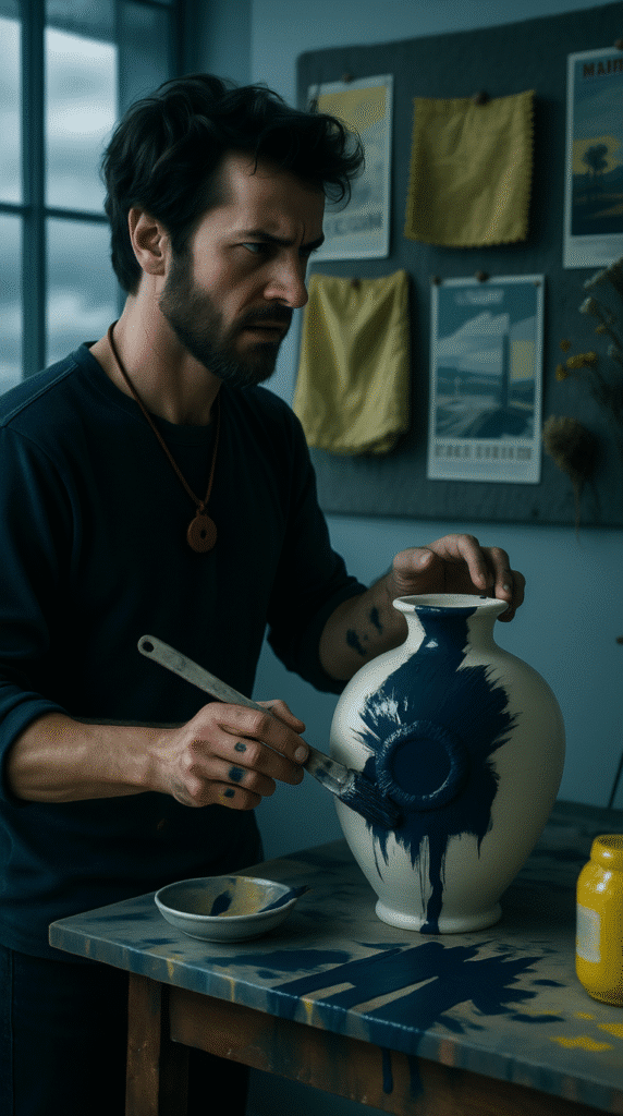
Then came the navy.
Not pale, not pastel—deep, confident blue.
The kind of color that stands in the corner at a party but somehow still steals your attention.
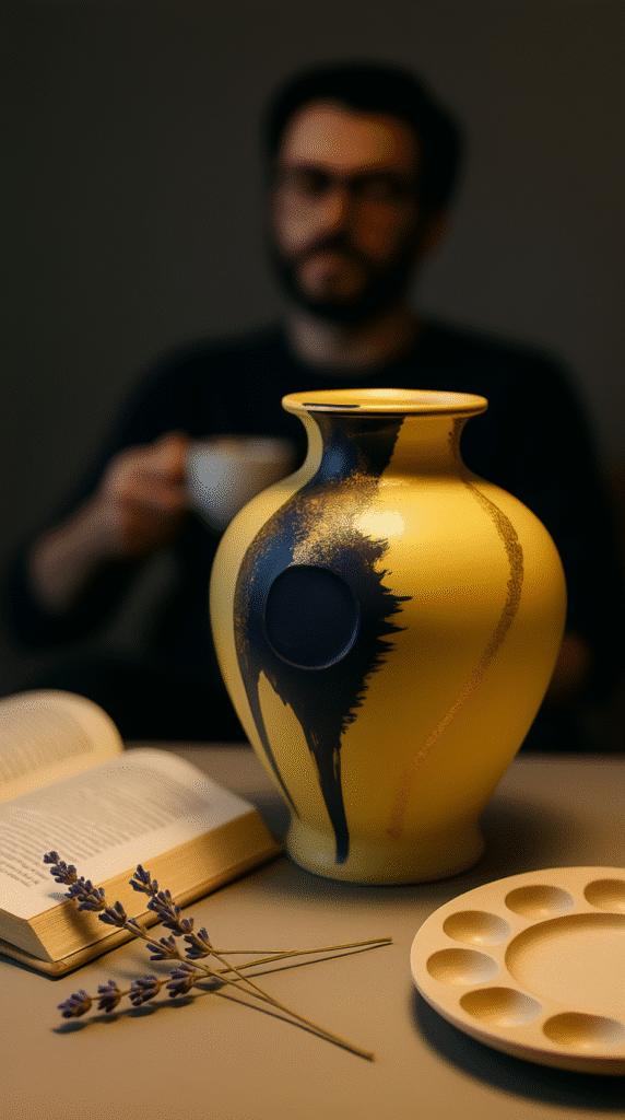
When the blue hit the yellow, the vase stopped being just “painted.”
It became a conversation between two personalities—one loud and bright, one calm but intense.
He didn’t blend them soft.
He let them crash, overlap, fight for space.
That tension made the colors stronger.
The Color Theory Behind the Choice
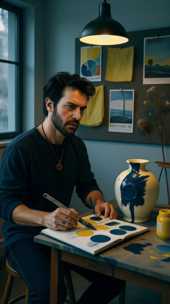
Yellow and blue are opposites in mood but neighbors on the color wheel.
Yellow brings warmth, blue brings coolness.
Together, they create balance without feeling boring.
If you’re doing a similar project, pick one color that excites you and one that steadies it.
That’s how you keep the energy without letting it get chaotic.
The Pause That Built Suspense
At this point, he stopped.
The vase was already beautiful—but unfinished.
It’s like hearing a song and knowing there’s still one more note before it’s complete.
The pause wasn’t hesitation.
It was patience.
Sometimes the best design choice is to wait and look before adding more.
The Golden Surprise
Then he reached for the gold leaf.
Thin sheets so delicate they move with the air when you breathe.
You can’t rush gold leaf—it demands slow, careful hands.
He pressed small patches into place, here and there.
Not too much. Just enough for light to catch it at the right angle.
The gold didn’t shout.
It whispered. And sometimes, whispers make people lean closer.
Why Gold Works in Small Doses

Gold isn’t just a color—it’s a signal.
It says, “This matters.”
But if you use too much, it starts screaming instead of speaking softly.
By adding it sparingly, he made the gold feel precious.
Viewers have to search for it, and that makes finding it more satisfying.
Texture Makes It Real
A lot of modern vases are machine-smooth.
This one wasn’t anymore.
You could see and feel the brush marks, the layered paint, the slightly uneven edges of the gold.
It made the vase feel handmade, even if it wasn’t originally.
And that’s something you can’t buy in a store—personality.
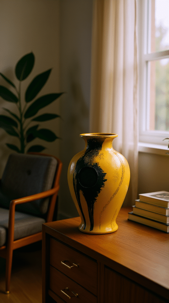
Placing It in the Room
When he set it on a shelf, it didn’t just sit there quietly.
It owned its space.
The yellow pulled your eyes first, the blue kept you looking, and the gold gave you little rewards for paying attention.
Everything else around it seemed to adjust, like the vase had become the boss of the shelf.
The Lesson in Bold Decisions
The magic wasn’t in the tools or even the technique.
It was in the choices.
Choosing a loud color. Pairing it with something deep. Adding just enough shine to make it special.
That’s how you get a piece that doesn’t just “match the room” but changes the room.
If You Want to Try This Yourself
Here’s the quick guide:
- Pick one daring color.
- Pick one calm but strong color.
- Add one surprising element—metallic, texture, or pattern.
Don’t aim for perfect.
Aim for personality.
Why This Vase Feels Like a Story
When you turn it in your hands, you see different moods.
One side might feel sunny and loud.
Another feels deep and thoughtful.
It’s not just decoration—it’s a little reminder that beauty isn’t one thing all the time.
The Final Spark
The vase could have been done after the yellow.
Or after the blue.
But the gold is what makes people stop and look again.
It’s the “next” thing he added that truly made it pop.
And sometimes, that one small step is the difference between nice and unforgettable.