There’s a little magic in picking the right color for your home’s exterior. It’s like dressing your house for the weather you want, not the weather you’ve got. In 2025, we’re not just painting walls—we’re painting moods, memories, entire personalities.
And yeah, colors still talk. Loudly sometimes.
Some say your front door whispers secrets to the street. Some say the shutters are giving side-eye to the neighbors. Either way, one thing’s for sure—the color of your home says something. Might as well let it scream elegance instead of mumbling “I give up.”
Let’s talk 2025. Let’s talk exterior colors. The kind you remember even after the car’s turned the corner.
Earthy Clay & Dusty Rose: The Comeback Combo
Yes. Clay is back. And it’s got friends.
This ain’t your grandma’s terracotta. We’re talking softer, almost powdery reds. Dusty rose paired with muted clay walls makes the house feel like it belongs to the earth itself.
Add pale bronze trim if you’re feelin’ extra brave. It’s subtle but not shy. Like someone who always knows what to say at dinner parties but never interrupts.
Perfect for stucco homes, Spanish revival, or even simple brick homes wanting a lil’ glow up.
And guess what? This works magic in low sunlight. Morning shadows dance on clay like they’re performing a secret ballet.
Deep Forest Green & Blackened Olive
This one? Bold. But not aggressive.
Forest green in 2025 isn’t just for cabins and getaway spots. It’s gone full-time. Mixed with blackened olive—basically a darker, moodier cousin—it gives your home this grounded, ancient sort of feel. Like it’s been there for centuries, quietly minding its business.
Add brass hardware. Maybe wood accents. Watch how it suddenly feels rich, like deep pockets and a weathered passport.
This color combo’s got personality. It don’t need to shout. It just exists. Like a forest in the middle of the city that refuses to move.
Soft Cream & Warm Charcoal
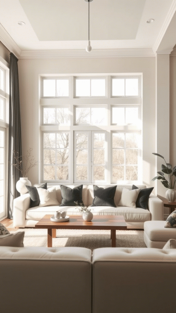
This one’s cozy. It hugs your house.
Cream is the sigh of relief. Charcoal is the warm hand on your back.
Put ’em together? They’re the emotional support duo you didn’t know your house needed. The cream does all the lifting—walls, main body. And then warm charcoal slips in quietly on the trim, window frames, or maybe the porch ceiling if you’re feelin’ artsy.
Bonus? These tones make your greenery look wild. Your front lawn becomes a painting, not a chore.
For homes in rainy climates, this is gold. Literally looks better wet.
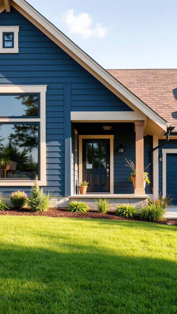
Misty Blue & Driftwood Gray
Okay okay, hear this out.
Blue doesn’t have to feel nautical. In 2025, misty blues have gone soft, airy, almost foggy.
Pair that with driftwood gray—something that looks like it’s been sun-faded on a beach in Greece—and you’ve got a scheme that feels ocean-adjacent but not cliché.
Think beach cottage but grown up. Like if a seashell started reading poetry.
Works like a charm on Cape Cods, ranch styles, or even little urban bungalows tryna breathe.
It’s chill. It’s coastal. But not in-your-face beachy. Like, it’s got sunscreen but it’s not wearing flip flops to dinner.
Black, White & The New Beige (aka Mushroom)
Still classic. But tweaked.
This trio is for the indecisive who still want to look like they meant it.
Black and white is always a flex, but throw in mushroom—a soft, earthy not-quite-gray, not-quite-brown shade—and it suddenly feels layered.
Try black trim on mushroom walls. Or reverse it—white walls, mushroom accents, black doors. Shuffle the deck until it clicks.
It’s sharp without being cold. Classy without being a try-hard.
Especially perfect for modern farmhouses or urban townhouses that want to whisper “I read architectural blogs.”
Muted Mustard & Soft Sage
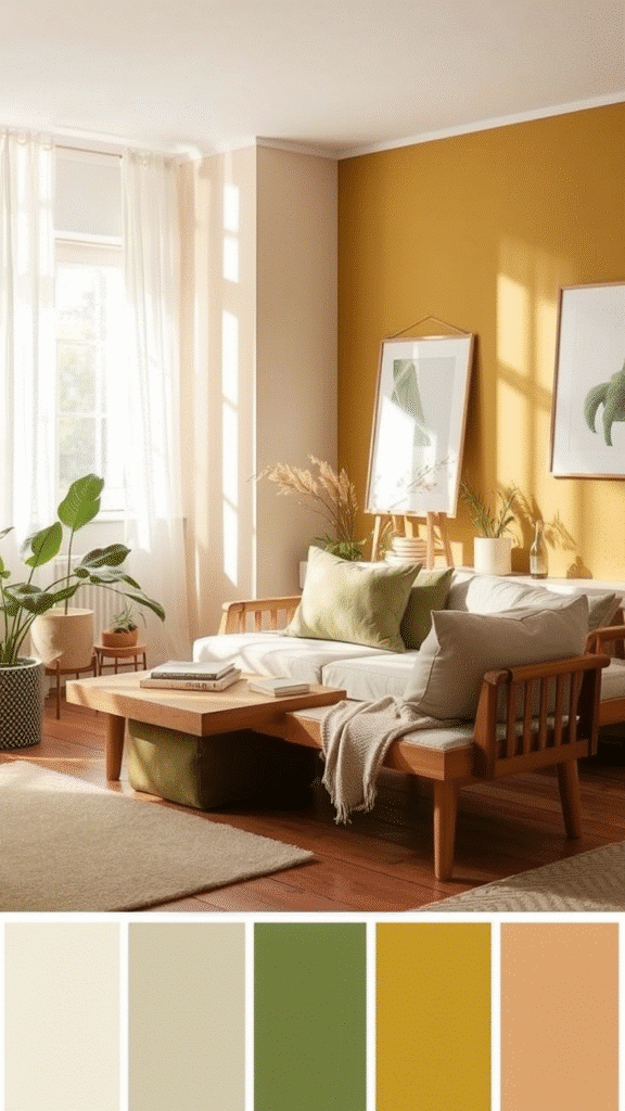
Yes. We’re doing mustard again.
But this ain’t hot dog mustard. This is muted, a little dusty, maybe even a lil sad—but in a beautiful, artsy way. The kind of mustard that went to design school and drinks espresso with oat milk.
Pair it with sage. That dusty green that can never decide if it wants to be gray or green.
These two are like the cool couple that thrift all their furniture and somehow it all matches even when it shouldn’t.
This one’s especially killer on Craftsman-style homes. With wood beams and textured stucco? Game over.
Midnight Teal & Bone White
Now this. This is drama.
Midnight teal is like navy blue that had a secret. Add bone white trim? Suddenly, your house looks like it belongs on the cover of a magazine they only sell in bookstores that smell like old paper and coffee.
The dark base absorbs light in the best way. Shadows sink in. It’s velvet for your walls.
Bone white keeps it from getting too heavy. Brightens it just enough, but still feels vintage. Like the color of antique lace, not a hospital wall.
Throw in brushed gold numbers or a giant matte black planter on the porch. Chefs kiss.
Sun-Washed Peach & Weathered White
2025 is emotional. So are these colors.
Peach doesn’t have to be pastel. It can be mature. With a sun-washed, slightly faded vibe, it brings that old-world Mediterranean charm. Makes you want to sip something cold under a striped umbrella.
Now, weathered white is the real MVP here. Not bright. Not sterile. Think of it as white with a little road trip behind it.
Put ‘em together? You get warmth. Softness. Maybe even a lil romance. Like your house is humming a quiet song from somewhere far away.
Graphite Blue & Pale Cedar
Graphite blue is moody but kinda flirty. Like it texts you at 2 a.m. but also remembers your birthday.
And pale cedar? Unexpected. It’s this washed-out, pinkish wood tone that shouldn’t work—but it does.
Pair these two and your home suddenly looks like a boutique hotel in Scandinavia. Minimal, sure. But full of feeling.
Great for colder climates. Especially homes with lots of windows. That icy air just makes these colors glow harder.
Sagebrush Green & Off-Black
Here’s the desert modern combo that’s sneaking into suburban streets.
Sagebrush green is soft, dry, whispery. It’s the wind through cactus leaves, if that was a color.
Off-black trim gives it edge. Doesn’t overpower. Just frames the softness with a little bite.
This one’s the stylish recluse of color schemes. Feels organic. Feels expensive. Looks like it hired a landscape architect even if all you got is three succulents and a hope.
Champagne Beige & Soft Pewter
There’s neutral. And then there’s wow-that’s-neutral.
Champagne beige sounds fancy, because it is. Has that slight sheen, like satin without trying too hard. And soft pewter? That muted gray with a metallic soul.
Together, they’re fancy without screaming. The kind of combo that would wear linen in November and make it work.
This duo loves sunlight. South-facing homes get that golden hour shine all day long.
What’s Out? (Don’t Shoot the Messenger)
- Bright red doors? They’re takin’ a nap this year.
- Ultra-white everything? Kinda cold, kinda done.
- Neon trims? Unless you’re a juice bar… maybe no.
- Gray-on-gray-on-gray? If your house looks like an overcast day… spice it up, please.
2025 wants colors with soul. Colors that breathe. Layers, texture, and weird little quirks that make people slow down when they pass.
If your house were a person—would it wear Crocs or loafers? Think about it. That’s your color scheme right there.
Unexpected Tips While You Paint
- Paint swatches outside. Look at them at 8am, 2pm, and sunset. They change. Like moods.
- Your roof color matters. Don’t ignore it. It’s like trying to wear socks with sandals and hoping no one notices.
- Nature matters. Got lots of trees? Go lighter. Got desert vibes? Go deeper.
- Paint the back of the house too. People forget that part. But birds are watching. Probably judging.
Final Thought
Colors are emotions frozen in pigment. What you slap on your house ain’t just paint. It’s storytelling, my friend. It’s your home’s mood, outfit, energy, and attitude.
In 2025, we ain’t doing boring beige unless it’s got champagne in it. We’re mixing clay with blush, blue with cedar, and putting the soul back into exteriors.
Choose colors that make your house smile. Or smirk. Or just nod coolly like, “Yeah, I know I look good.”
Pick a combo that makes the mailman pause. That makes people take their phones out. That makes you fall in love with your own front porch all over again.
FAQs
Q1: What’s the safest exterior color combo for resale value in 2025?
Muted cream and charcoal still reign supreme. They look clean, modern, and not too wild for most buyers.
Q2: Are dark exterior colors harder to maintain?
A bit, yes. They show dust and fading more. But with proper finish and quality paint, they last surprisingly well.
Q3: Should the trim always contrast the wall color?
Not always. 2025 is loving tone-on-tone trim. It can look super luxe and quiet at the same time.
Q4: Can I mix warm and cool tones?
Heck yes, if you do it right. Just keep one as the dominant and use the other as an accent.
Q5: Do exterior colors look different in sunlight vs shade?
Totally. Some colors look happy in sun and miserable in shade. Always test in both before committing.