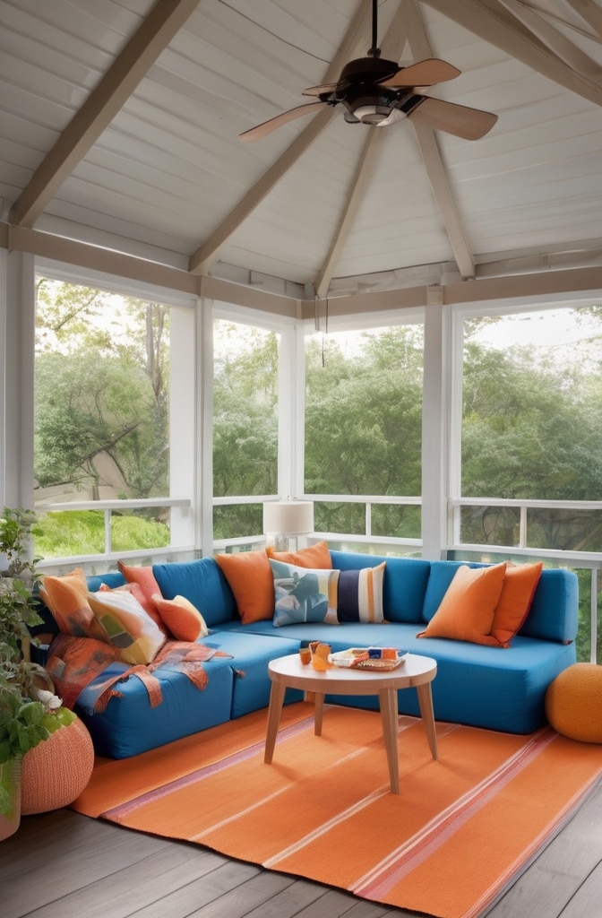
Have you ever walked into a room and felt immediately at peace? Chances are, blue or green might have been part of the color palette. When combined, these two colors create a living space that balances tranquility with vitality in a way few other combinations can achive. From the deepest navy to the softest sage, blue and green living room ideas offer endless possibilities for creating spaces that reflect your personal style while providing a naturally soothing environment.
After redesigning my own living room with a teal sofa against sage green accent walls, I’ve witnessed firsthand how this color duo can completely transform a space. The compliments from visitors are nice, but it’s the way the room now feels—simultaneously energizing and calming—that makes the biggest difference in daily life.
In this guide, we’ll explore why blue and green create such magic together, how to find your perfect palette, and practical ideas for incorporating these colors into any living room style. You’ll discover combinations that interior design magazines rarely highlight and learn expert techniques for balancing these hues for maximum impact.
Why Blue & Green Work So Harmoniously Together
There’s a reason why blue and green pairings feel so natural to us—they’re literally the colors of our natural world. They sit beside each other on the color wheel, making them analogous colors that naturally complement one another.
“Blue and green are what we call ‘cool neighbors’ on the color wheel,” explains color psychologist Dr. Marissa Jackson. “Their proximity creates harmony while their subtle differences provide enough contrast to keep spaces visually interesting.”
This natural affinity shows up repeatedly in nature:
- The meeting point of forest and sky
- Ocean waters transitioning to coastal vegetation
- Peacock feathers with their iridescent blue-green patterns
- Northern lights dancing across the night sky
These colors also carry powerful psychological effects. According to a 2023 study in the Journal of Environmental Psychology, blue spaces tend to reduce stress and anxiety, while green environments improve mood and cognitive function. When combined in interior spaces, they create rooms that feel both rejuvenating and calming.
Historically, blue-green color schemes have appeared in design traditions worldwide, from the turquoise and jade combinations in Moroccan riads to the celadon and indigo pairings in traditional Japanese interiors. This cross-cultural appreciation speaks to these colors’ universal appeal.
Finding Your Perfect Blue & Green Palette
The beauty of blue and green combinations lies in their versatility—there’s a perfect palette for every aesthetic and living situation. The key is understanding the different dimensions of color and how they work together.
Cool vs. Warm Undertones
Blues and greens each come with different undertones that dramatically affect how they pair together:
- Cool blues (with purple undertones) pair beautifully with cool greens like sage or mint
- Warm blues (with slight green undertones) work well with olive or forest greens
- Neutral blues like true navy complement almost any green
Designer Elaine Rodriguez of Modern Home Concepts recommends testing undertones by placing paint samples next to a pure white sheet of paper: “You’ll immediately see whether colors lean warm or cool, which helps ensure your blues and greens will harmonize rather than clash.”
The Intensity Spectrum
Another consideration is color intensity. Your perfect palette might fall anywhere on this spectrum:
- Soft pastels: Sky blue with mint green creates airy, light spaces
- Mid-tones: Teal with olive green offers balanced warmth
- Jewel tones: Sapphire blue with emerald green provides dramatic richness
- Dusty hues: Slate blue with sage green delivers subtle sophistication
For cohesive combinations, interior designer Marcus Chen suggests “keeping your blues and greens at similar saturation levels unless you’re deliberately creating contrast. Two medium-intensity colors will generally work better together than pairing a very intense color with a very muted one.”
The 60-30-10 Rule Applied
When working with blue and green, the classic 60-30-10 rule provides a helpful starting point:
- 60% dominant color (walls, large furniture)
- 30% secondary color (accent furniture, curtains)
- 10% accent color (accessories, art)
With blue and green schemes, consider using one as your 60%, the other as your 30%, and introducing a neutral or metallic as your 10% accent. Alternatively, use a neutral as your 60% base, with blue and green splitting the remaining percentages.
Design Styles Enhanced by Blue & Green
One of the most versatile aspects of blue and green color schemes is how well they adapt to different design styles. Let’s explore how these colors enhance various interior aesthetics:
Classic Elegance
For timeless sophistication, navy paired with moss or olive green creates a richly layered look that feels established yet fresh. This combination works particularly well in traditional spaces with architectural details.
To achieve this look:
- Paint walls in a deep navy like Benjamin Moore’s “Hale Navy”
- Add moss green velvet upholstery on wingback chairs
- Incorporate antique brass fixtures for warmth
- Include ivory or cream accents to brighten the palette
Interior designer Katherine Palmer notes, “The key to making classic blue and green pairings feel current rather than stuffy is incorporating modern textiles and at least one unexpected element—perhaps an abstract painting or contemporary light fixture.”
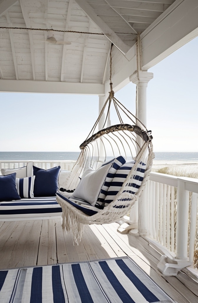
Coastal Retreat
Soft blues combined with seafoam green create a breezy, relaxed atmosphere reminiscent of beachside getaways. This palette excels in spaces that receive plentiful natural light.
Essential elements include:
- Weathered woods in light to medium tones
- Natural fiber textures like jute, sisal, and linen
- Varied blue tones from pale sky to deeper ocean hues
- Botanical accents that echo seaside vegetation
According to a 2024 survey by Home Style Trends, coastal blue-green palettes remain among the top choices for vacation properties, with 67% of beach house owners choosing some variation of this combination for their main living spaces.
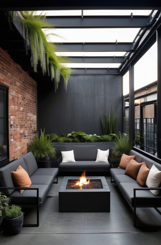
Dramatic Noir
For those who prefer spaces with depth and moodiness, the combination of deep navy with forest green creates a cocooning environment with undeniable sophistication.
This bold approach works best when:
- Walls embrace darkness (try Farrow & Ball’s “Hague Blue”)
- Textures add dimension through velvet, wool, and leather
- Lighting is layered and atmospheric rather than overhead
- Metallics like brass and gold provide essential contrast
“Dark blue-green rooms need moments of brightness to prevent the space from feeling cavernous,” advises lighting designer Thomas Warren. “Consider wall sconces with warm-temperature bulbs positioned to create pools of light that highlight key elements.”
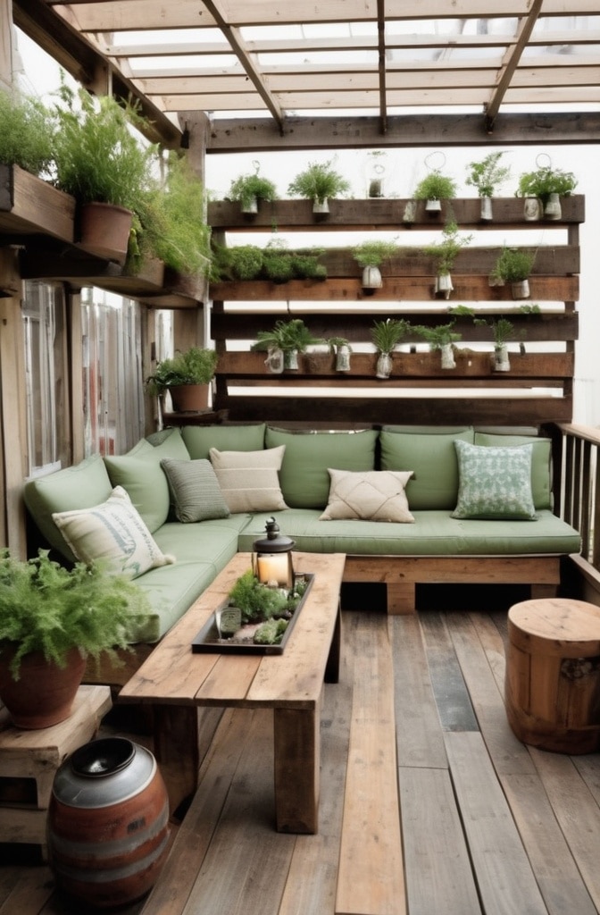
Garden Fresh
Light blue paired with sage green creates spaces that feel like an extension of the outdoors—airy, fresh, and endlessly calming.
This combination works particularly well when:
- Walls feature the lighter of your chosen hues
- Natural materials like light woods and stone are incorporated
- Actual plants become part of the color story
- Textiles include botanical patterns or subtle textures
According to research from Harvard’s Healthy Buildings Program, rooms designed with nature-inspired color schemes like this one show measurable improvements in occupant wellbeing, with reduced stress markers and improved cognitive performance.
Luxe Living
Deep navy combined with emerald green creates a jewel-box effect that feels undeniably luxurious, especially when accented with metallics.
Key elements for this high-end look include:
- Sumptuous fabrics like velvet and silk
- Polished surfaces that reflect light
- Intentional contrast between dark and bright elements
- Statement lighting that serves as functional art
“The velvet texture is practically mandatory for luxurious blue and green spaces,” says fabric specialist Elena Morales. “It captures and reflects light differently throughout the day, making these colors appear almost three-dimensional.”
Small Space Solutions with Blue & Green
Contrary to conventional wisdom that small spaces require white walls, blue and green can actually enhance compact living rooms when applied strategically.
Optical Illusions with Color Placement
The placement of your blues and greens can dramatically affect spatial perception:
- Painting the ceiling a soft blue makes it appear higher
- Using a deeper green on an accent wall at the far end of a narrow room creates the illusion of width
- Keeping wainscoting white while using color above creates balance
Designer Sarah Thompson, known for her work with urban apartments, suggests, “In spaces under 400 square feet, consider a monochromatic approach using different values of the same blue or green. This creates dimension without the choppy feeling that high-contrast schemes can create in small spaces.”
Glass, Mirrors, and Reflective Surfaces
To maximize light and visual space:
- Position mirrors to reflect windows or attractive views
- Choose glass coffee tables over solid wood in dark colors
- Incorporate metallic accents that bounce light around the room
- Consider glossy paint finishes in darker blue-green rooms
A recent case study by Small Space Design Quarterly featured a 350-square-foot studio apartment that used seafoam green walls with navy accents. By incorporating strategic mirror placement and glass furniture, the space appeared nearly twice its actual size.
Foundational Elements: Walls & Floors
Your walls and floors create the canvas for your blue and green living room, and they deserve careful consideration beyond simple paint colors.
Beyond Solid Paint Colors
Consider these alternatives to basic painted walls:
- Color blocking: Combine two blues or a blue and green with a clean dividing line
- Ombré effect: Gradually transition from blue to green vertically
- Wallpaper: Incorporate patterns that combine your chosen hues
- Textured finishes: Try lime wash or venetian plaster in blue or green tones
“Wall treatments that incorporate dimension add another layer to blue-green spaces,” explains finishing expert Ricardo Gomez. “A hand-applied lime wash in a soft teal, for instance, creates subtle movement that flat paint simply cannot achieve.”
Flooring That Complements Blues and Greens
Your floor choice dramatically affects how blue and green elements appear in the space:
- Light woods (oak, ash, maple) brighten blue-green schemes
- Mid-tone woods (walnut, cherry) add warmth to cooler blues
- Gray-washed woods enhance contemporary blue-green palettes
- Natural stone like slate or limestone complements earthy green tones
According to flooring industry data from FloorDaily.net, engineered hardwood in light to medium tones remains the most popular flooring choice for living rooms featuring blue and green color schemes, with 72% of designers recommending these options for their complementary qualities.
Furniture Selection & Arrangement
Your furniture provides major color opportunities while defining how your space functions and feels.
Statement Pieces vs. Neutral Foundations
When incorporating blue and green, decide whether your larger furniture will provide the color or serve as a neutral foundation:
Color Through Furniture:
- A navy velvet sofa becomes the room’s anchor
- Emerald green accent chairs create focal points
- Painted blue or green case goods add color without overwhelming
Neutral Furniture with Color Accents:
- Beige, gray, or white upholstery lets walls and accessories carry the color story
- Natural wood pieces warm up cool blue-green palettes
- Transparent or metallic furniture maintains visual lightness
“The average sofa lasts 7-15 years,” notes furniture designer Adrian Perez, “so if you’re committing to a blue or green sofa, choose a shade with longevity that you won’t tire of quickly. Navy, teal, and forest green tend to have more staying power than brighter or trendy blues and greens.”
Upholstery Considerations
Not all fabrics hold color equally. Consider these factors when selecting blue or green upholstery:
- Velvet showcases rich blues and greens with unmatched depth
- Linen gives blues a casual, lived-in quality perfect for coastal styles
- Performance fabrics now come in excellent blue and green options for family-friendly spaces
- Leather in navy or forest green offers sophisticated durability
In a recent durability test by Furniture Today magazine, navy blue performance velvet ranked highest for color retention after simulated years of use, maintaining 94% of its original color saturation after the equivalent of five years of regular use.
Wood Tone Integration
The wood tones in your space dramatically affect how your blues and greens appear:
- Light woods (oak, ash, maple) create contrast with deep blues and greens
- Walnut complements most blue-green combinations with its warm, mid-tone finish
- Ebonized wood creates sophisticated contrast with lighter blues and greens
- Weathered or gray-washed woods enhance coastal blue-green schemes
For mixed-wood spaces, designer Olivia Chen recommends, “Choose one dominant wood tone for large pieces, then one complementary tone for accents. More than two wood finishes tends to create visual chaos, especially with colored upholstery in the mix.”
Layering Textures & Materials
The most successful blue and green living rooms incorporate varied textures to add visual and tactile interest to the color scheme.
Textile Combinations
Textiles provide easy opportunities to introduce multiple blues and greens:
- Layer solid and patterned pillows in varied shades
- Combine different fabric types—linen, cotton, velvet, wool
- Add window treatments that complement or contrast with walls
- Include throws that introduce additional blue-green variations
Interior stylist Rebecca Wong explains, “In monochromatic blue or green spaces, texture becomes even more crucial. A room with navy walls, a navy sofa, and navy accents would fall flat without deliberate texture variation—think ribbed glass vases, chunky knit throws, smooth velvet, and rough jute.”
Material Mixing Guide
Beyond fabrics, consider how different materials interact with your blue-green palette:
- Metals: Brass warms up cool blues, while chrome enhances their crispness
- Glass: Blue or green glass objects add translucent color dimensions
- Ceramics: Handmade pottery in varied blue-green glazes adds artisanal character
- Stone: Marble with blue or green veining creates sophisticated connections
According to materials specialist David Porter, “The current trend leans toward mixing at least three distinct material types within blue-green living spaces. This prevents the room from feeling flat or one-dimensional, regardless of how cohesive the color palette might be.”
Accessorizing Your Blue & Green Living Room
The final layer of any successful blue and green living room comes through thoughtfully chosen accessories that enhance and complete your color story.
Textile Accents
Soft goods offer the easiest way to adjust and refine your blue-green palette:
- Pillows: Mix solids with patterns incorporating both blues and greens
- Throws: Add textural interest through chunky knits or soft weaves
- Curtains: Frame windows with fabric that complements or contrasts with walls
- Area rugs: Ground the space with patterns combining your key colors
“I always recommend clients invest in pillow covers rather than whole new pillows when they want to refresh their blue-green spaces,” says home stylist Jennifer Burke. “Seasonally swapping deep teals for lighter aquas can completely transform the feeling of a room for minimal cost.”
Botanical Elements
Plants enhance blue and green rooms by adding living color and texture:
- Snake plants provide structural vertical lines
- Ferns add feathery texture that complements soft blues
- Succulents offer blue-green tones that bridge color families
- Cut eucalyptus brings a blue-green element to tabletop styling
According to plant specialist Michael Torres, “Blue-green walls actually make plants pop more than white walls do, creating visual contrast that highlights the unique greens of your plants. Look for varieties with silver-blue undertones like eucalyptus for spaces with teal or aqua elements.”
Wall Art Selections
Art can unite your blue and green elements while adding personality:
- Abstract pieces incorporating both colors create cohesion
- Landscapes naturally feature blue skies and green foliage
- Botanical prints highlight varied green tones
- Seascapes showcase endless variations of blue
Gallery owner Patricia Schultz notes, “We’ve seen a 40% increase in clients seeking art specifically to complement blue-green interiors. The most successful pieces typically incorporate both colors but add at least one unexpected hue—perhaps a touch of coral or ochre—to prevent the space from feeling too predictable.”
Seasonal Adaptability
One of the greatest strengths of blue and green color schemes is their year-round appeal with minimal seasonal adjustments needed.
Easy Seasonal Swaps
To keep your blue-green living room fresh throughout the year:
Spring/Summer:
- Lighten with pale blue and mint green accessories
- Add natural elements like driftwood and beach glass
- Incorporate botanical patterns in pillows and throws
Fall/Winter:
- Deepen the palette with navy and forest green accents
- Add warmth through copper or brass metallic elements
- Introduce richer textures like velvet and wool
Designer Sophia Chen explains, “Blue-green rooms require less seasonal adjustment than many other color schemes. Simply shifting the balance toward blues in summer and greens in fall often provides sufficient seasonal change while maintaining overall harmony.”
Lighting Considerations
The way light interacts with blue and green dramatically affects how these colors appear:
- North-facing rooms benefit from warmer blues and greens to counteract cool light
- South-facing rooms can handle cooler blues as they receive warm natural light
- Consider adjustable lighting with dimmers to adapt the mood
- Use warm-temperature bulbs (2700-3000K) to prevent blues from appearing too cold
Lighting designer James Peterson notes, “The biggest mistake I see in blue-green rooms is insufficient lighting layers. These colors absorb more light than neutrals, so you need approximately 25% more lumens than you would in a beige or white space.”
Real Home Examples & Case Studies
Let’s look at how real homeowners have successfully implemented blue and green living room designs across different budgets and styles.
Budget-Friendly Transformation: The Miller Family
When the Millers wanted to refresh their living room on a $500 budget, they:
- Painted walls Benjamin Moore “Ocean Floor” (a medium blue-green)
- Added green velvet pillow covers to existing neutral furniture
- Incorporated brass picture frames and candleholders
- Installed DIY floating shelves for plants and blue glass accessories
“We were amazed at how different the space felt with just paint and a few strategic additions,” says homeowner Jessica Miller. “The blue-green walls completely changed how our existing furniture looked—in a good way!”
Luxury Redesign: The Westbrook Residence
For a high-end renovation, the Westbrooks worked with designer Lauren Albright to create:
- Custom navy velvet sectional with emerald green accent pillows
- Hand-painted chinoiserie wallpaper featuring blue-green botanical motifs
- Antique brass lighting fixtures throughout
- Vintage Oushak rug incorporating blue, green, and cream
“We wanted a space that felt both timeless and current,” explains homeowner Michael Westbrook. “The blue and green palette gave us that perfect balance of classic and fresh.”
Read This Blog: https://hometranquil.com/concept-kitchen-living-room/
Designer Insights
Three leading designers share their approaches to blue-green living spaces:
Sara Jensen, Modern Minimalist: “I layer different values of the same blue or green rather than mixing distinct colors. This creates depth without busyness—perfect for clients seeking calm, uncluttered spaces.”
Marcus Lee, Eclectic Designer: “I love pairing unexpected blues and greens—think mint with navy or forest green with powder blue. These unexpected combinations create spaces that feel both designed and personal.”
Amara Washington, Transitional Specialist: “For clients hesitant about color commitment, I introduce blue and green through art and accessories first. Once they see how these colors enhance their space, they’re often ready for larger color statements.”
Common Mistakes to Avoid
Even with such a naturally harmonious color pairing, certain pitfalls can compromise your blue and green living room design.
Color Balance Pitfalls
Watch out for these common balance issues:
- Using too many different blues and greens without a clear hierarchy
- Creating harsh transitions between very different values
- Neglecting to include neutrals as visual resting points
- Choosing blues and greens with conflicting undertones
Color consultant Diane Roberts advises, “Before committing to paint or large furniture pieces, create a physical layout of your exact blues and greens—fabric swatches, paint chips, accessory photos—all together in natural light. This reveals undertone conflicts that digital renderings often miss.”
Pattern Problems
When incorporating patterns:
- Limit yourself to 2-3 pattern scales (large, medium, small)
- Ensure patterns share at least one common color
- Balance busy patterns with solid areas of color
- Consider the room’s size—larger patterns need space to breathe
According to interior photographer Thomas Liu, “The most photogenic blue and green rooms maintain a ratio of roughly 70% solid color to 30% pattern. This provides visual interest without overwhelming the space.”
Neglecting Lighting Considerations
Blue and green rooms have specific lighting needs:
- Both colors absorb more light than neutrals, requiring additional sources
- Cool-temperature bulbs can make blues appear harsh and institutional
- Insufficient lighting makes greens look muddy or drab
- Single overhead lighting creates unflattering shadows with darker blues
Lighting designer Emma Chen notes, “For every blue or green room, I recommend a minimum of three light sources at different heights, all with warm-temperature bulbs. This brings out the richness of these colors rather than flattening them.”
Conclusion
Blue and green living room ideas offer endless possibilities for creating spaces that feel simultaneously fresh and timeless, energizing and calming. From the deepest navy to the softest sage, these colors provide a versatility few other palettes can match.
As you’ve seen, successful blue and green spaces rely on thoughtful consideration of undertones, intensity, texture, and lighting. Whether you’re drawn to classic elegance, coastal casual, dramatic luxury, or fresh minimalism, there’s a blue-green combination perfectly suited to your aesthetic vision.
Remember that the most successful spaces evolve gradually. Start with the elements that speak most strongly to you—perhaps wall color or a statement sofa—and allow your blue-green living room to develop organically as you discover pieces that enhance your core palette.
I hope this guide has inspired you to explore the refreshing possibilities of blue and green in your own living space. If you’ve created a blue-green room you love, we’d be delighted to see photos in the comments below!
Resources
Paint Colors Worth Considering
- Benjamin Moore “Hale Navy” (deep blue)
- Farrow & Ball “Breakfast Room Green” (mid-tone green)
- Sherwin Williams “Rainwashed” (soft blue-green)
- Behr “Secret Meadow” (sage green)
Furniture Sources
- Budget-friendly: Article, Joybird, IKEA (Farlov sofa in blue)
- Mid-range: West Elm, Crate & Barrel, CB2
- Investment pieces: Mitchell Gold + Bob Williams, Room & Board
Online Design Resources
- Pantone Connect (color matching app)
- Pinterest Blue-Green Living Room Board
- Houzz ideabooks for blue and green spaces
Further Reading
- “Living with Color” by Rebecca Atwood
- “The Perfect Palette” by Stephanie Hoppen
- “Elements of Style” by Erin Gates