Alright. White cabinets? Been there. Beige? Honestly, no one remembers beige. And grey? Let’s just say it’s the yoga pants of kitchen colors—comfy but kinda everywhere.
So what happens when you wanna break things up a bit? What if you’re craving a kitchen that says, hey look at me, I got personality, but still doesn’t scream like a clown in a haunted house?
This is where the magic of alternative cabinet colors comes in. These ain’t your usual choices. These are the bold, the moody, the straight-up underdogs of kitchen style. They might not be everyone’s cup of chai, but if you’ve got even a lil’ sprinkle of design rebellion in your bones… keep reading.
1. Deep Olive Green – Not Your Garden Variety
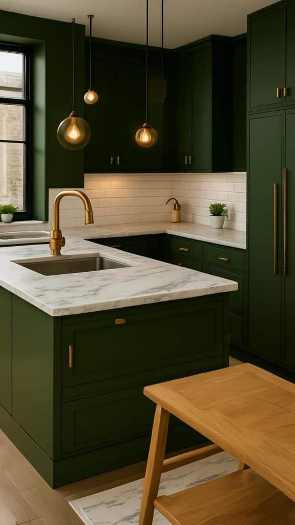
This color’s got something earthy. Not dusty-forest boring. More like lush, expensive, old-mansion-walls kinda green.
Olive green cabinets somehow feel cozy and upscale at the same time. Pair it with brass hardware, and boom—you’ve got yourself a kitchen that looks like it belongs in an artsy Paris flat. Not a bland showroom.
Also, olive hides dirt like a dream. It’s the unsung hero for chaotic cooks and lazy cleaners (no shame in the game).
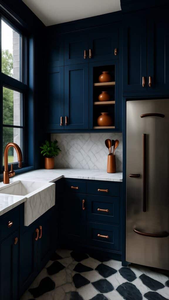
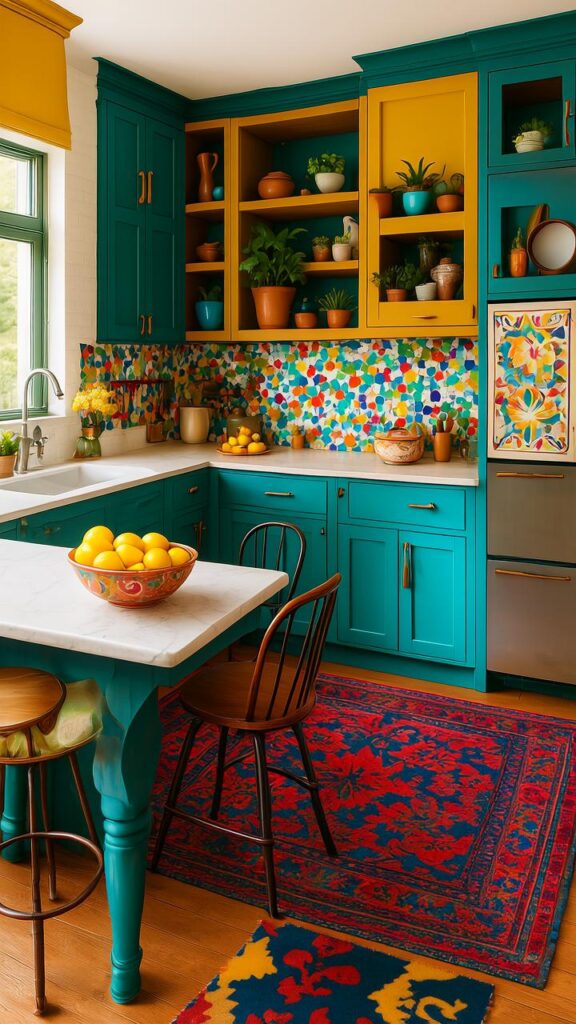
2. Navy Blue – Like a Tuxedo for Your Cabinets
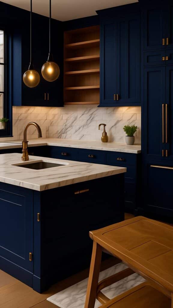
Navy blue is classy. But also mysterious. It’s the cabinet color equivalent of that friend who always smells amazing but never says what cologne they use.
The depth of this color makes your kitchen feel rich. Not money-rich necessarily, but story-rich. History-rich.
And against white tile or marble countertops? Oh man. That contrast slaps. Try matte finish for that modern edge. Or go glossy if you’re feelin’ dramatic.
3. Mustard Yellow – Bold, But Make It Cool
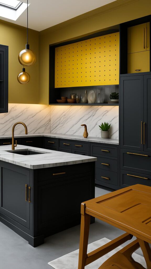
Not the Crayola yellow. No no. We’re talkin’ mustard. That deep, slightly burnt, warm yellow that looks like it came straight outta a 1970s Italian cookbook.
It’s unexpected in the kitchen. But somehow… it works. It gives off “I bake sourdough and wear vintage aprons” energy.
Surprisingly, mustard yellow works like a neutral in funky kitchens. Add plants and wood shelves? Chef’s kiss. Your kitchen will be vibin’ hard.
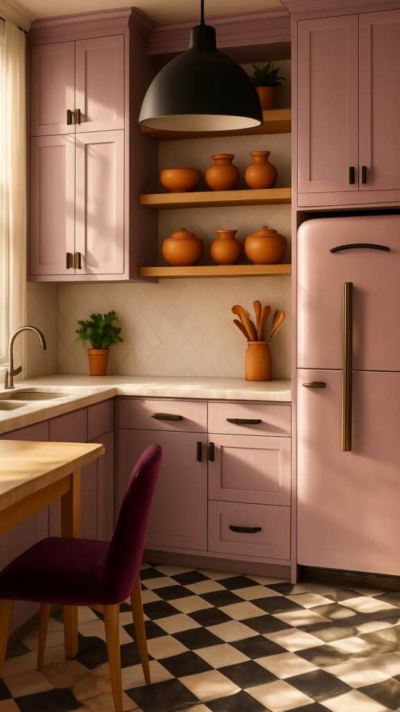
4. Dusty Rose – The Soft Rebel
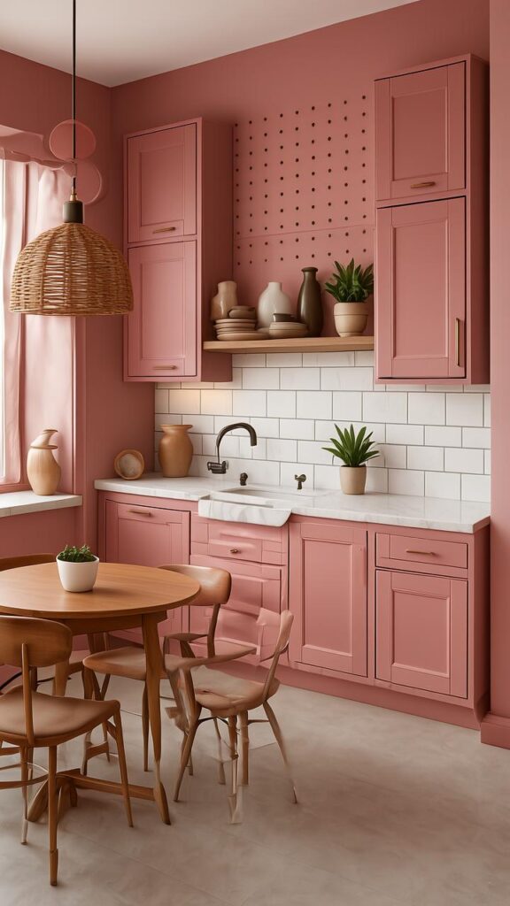
Pink cabinets? You bet. But not Barbie pink. That’s for dream houses, not real ones.
Dusty rose has this kinda romantic, grown-up thing going on. It’s gentle but not too precious. Think clay. Think sun-faded flowers on a windowsill.
If your kitchen has natural light? This color glows. Literally. It makes your kitchen feel like a warm hug with lipstick on.
5. Charcoal Black – The Villain Era (But in a Good Way)
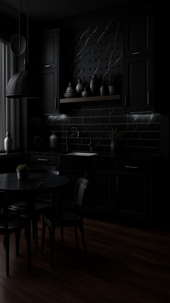
Black cabinets are not for the faint of heart. But oh boy do they deliver.
Charcoal black isn’t stark or cold—it’s moody, smooth, and downright powerful. Especially when it’s got a soft matte finish that almost absorbs the light.
They make your kitchen feel like a secret lair where gourmet things happen. Add gold handles and you’re officially operating in luxury mode.
Bonus: black hides everything. Smudges, chips, the sins of last night’s failed banana bread… all gone.
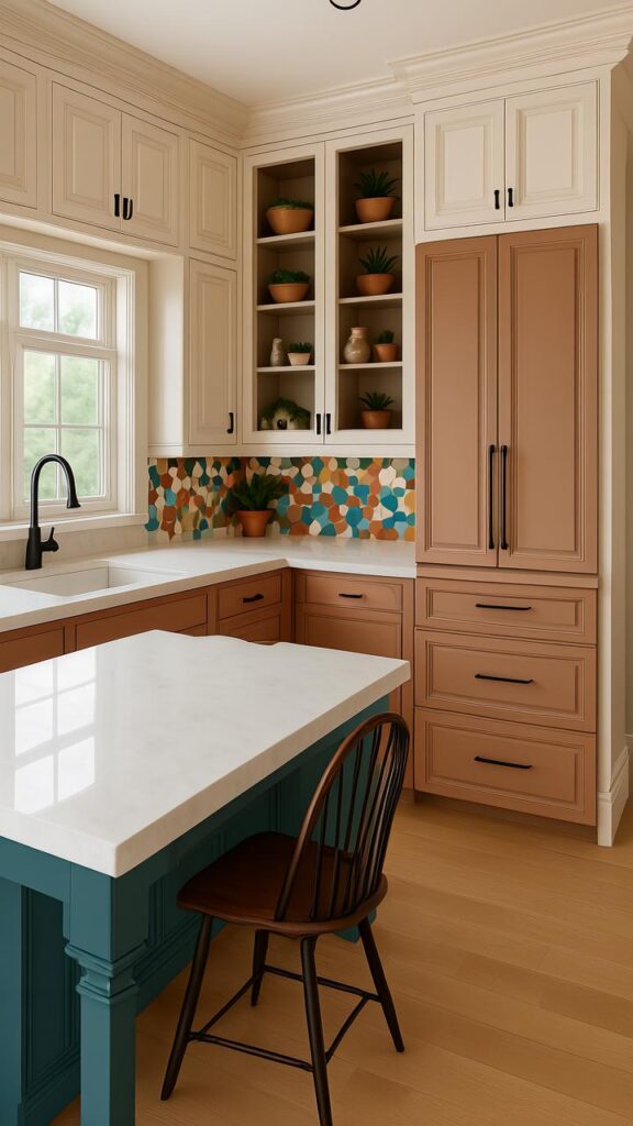
6. Terracotta – Warm, Spicy, and a Bit Unexpected
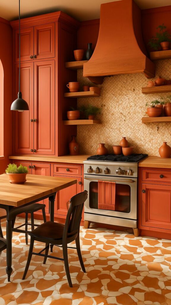
You probably think of flower pots or desert tile when you hear terracotta. But imagine that warmth wrapped around your cabinets.
It’s earthy, but not boring. Kinda like if adobe and cinnamon had a baby.
Terracotta cabinets with cream walls and open wooden shelves? Honestly, it looks like you vacation in Morocco and only eat meals made with fresh herbs. Even if you actually just eat instant noodles, it feels different here.
7. Teal – Not Blue, Not Green, Just Perfect
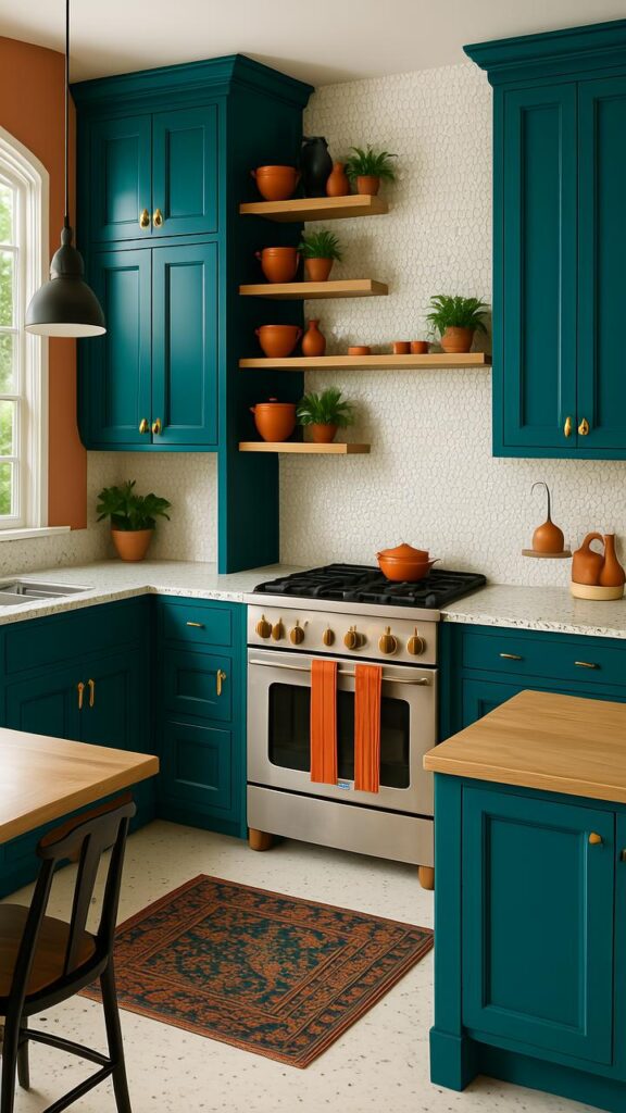
Teal walks that delicate line between playful and sophisticated. It’s like the mullet of cabinet colors—business AND party, all in one.
This color pops like crazy, especially in white or light wood kitchens. It’s the kinda bold that makes people go “Whoa. Didn’t expect that. But love it.”
You can take teal tropical with rattan accents or glam it up with marble and gold. It’s a chameleon. But cooler.
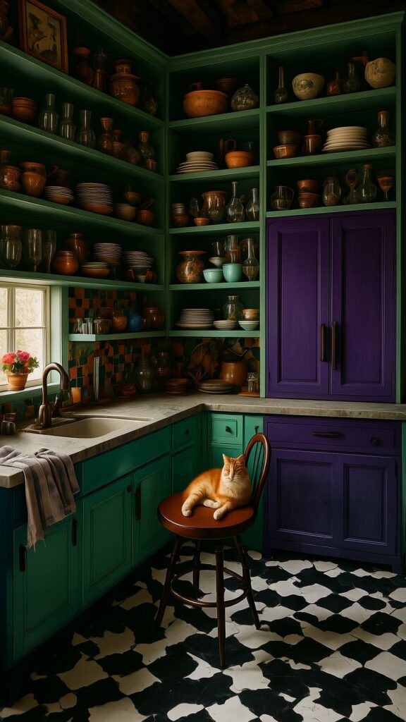
8. Plum – The Moody Diva
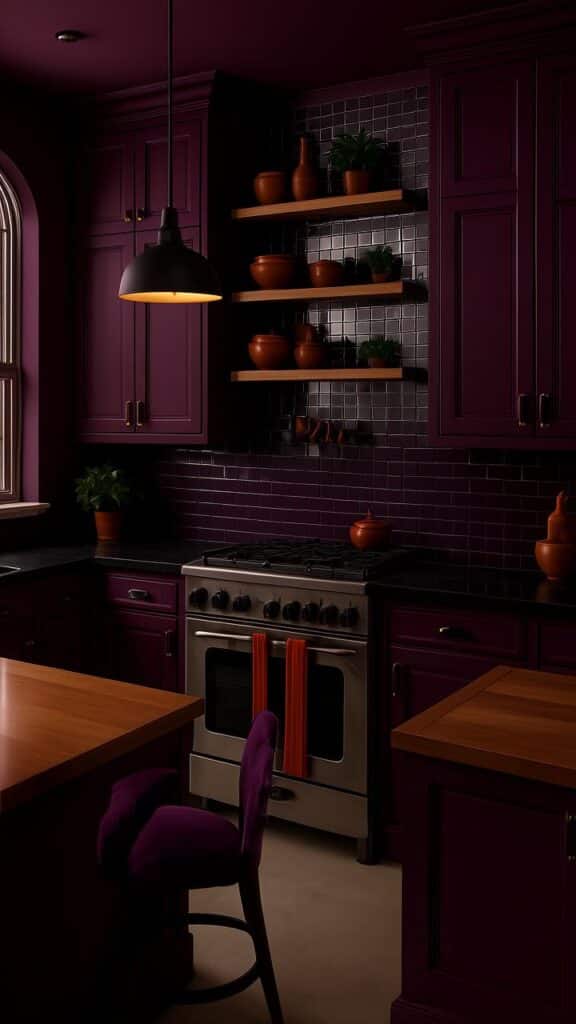
Purple gets a bad rap in the kitchen world. Too loud, too tricky. But plum? Plum is its elegant, velvet-gloved cousin.
This shade adds depth, mystery, and a whole lot of drama. It’s the kitchen color equivalent of sipping red wine in silk pajamas.
Plum looks insane next to cream or copper tones. It’s also amazing for smaller kitchens—it pulls the space in and makes it feel rich, like a secret lounge for snacking.
9. Mint Green – Fresh AF
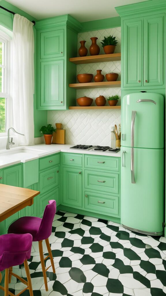
Now mint gets slept on a lot. People think it’s too sweet. But when done right? Mint green cabinets can feel clean, retro, and totally refreshing.
This color is like a breath of fresh air. Literally. You look at it and feel 10% cooler, even if your oven’s currently on fire.
Pair mint with white subway tile, black grout, and maybe a smeg fridge if you’re feelin’ fancy. It’s the brunch of colors—light, stylish, and always hits the spot.
10. Burnt Orange – Loud in the Best Way
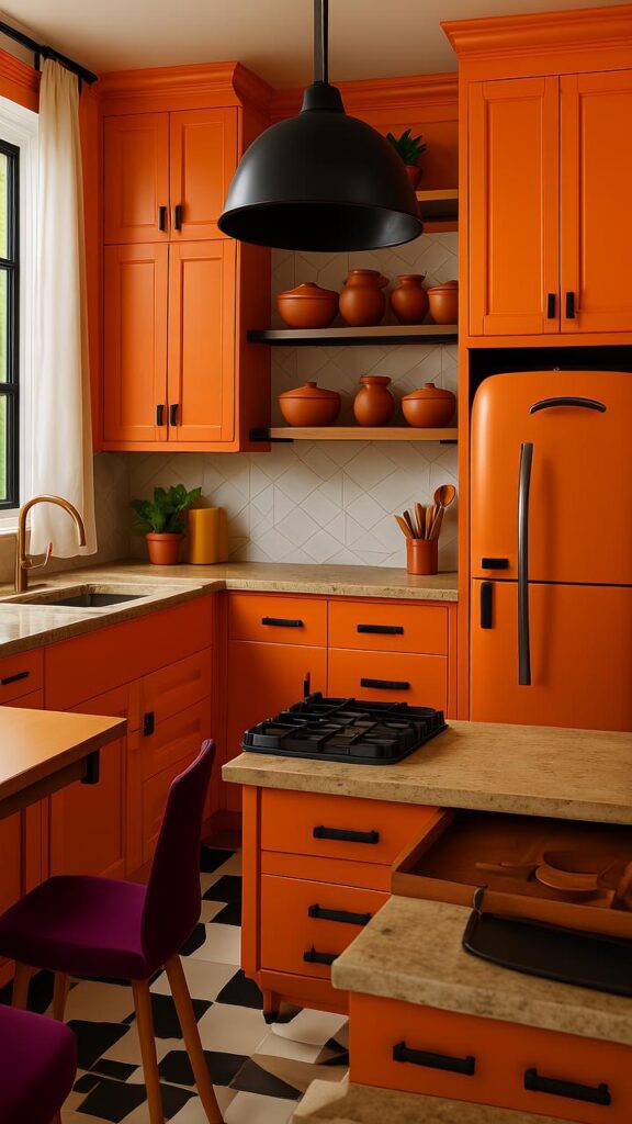
You wanna talk brave? Let’s talk orange. But not safety-vest orange. We’re talkin’ burnt orange—like campfires, fall leaves, and fancy cocktails at sunset.
It’s loud. But it’s also warm. Inviting. A little cheeky. Makes your kitchen feel like the kind of place where people tell stories around the stove.
Burnt orange and dark walnut countertops? Game. Over. Everyone will think you hired a designer. You didn’t. You just got taste.
The Magic Is in the Finish
Real quick sidenote. Color matters, obviously. But don’t forget the finish. Glossy adds glam, matte brings depth, and satin is that happy middle.
Also: lighting. These colors will look totally different under warm vs cool bulbs. So, test swatches before you commit. Tape ‘em up. Live with ‘em for a few days. Let ‘em speak to you.
Hardware Can Flip the Script
Change the handles, change the mood. Brass brings elegance. Matte black is modern. Copper? Oof. That’s a whole vibe.
Sometimes even the weirdest color choice can look amazing if the hardware is just right. Don’t sleep on the knobs, folks.
Color + Personality = Your Dream Kitchen
Here’s the truth. The “best” color doesn’t exist. Only your best color does.
You want something that makes you smile when you grab your morning mug. That makes guests say, “Wait, THIS is your kitchen??” That makes burnt toast feel like an aesthetic choice.
Trends come and go. But bold choices? They stick around. They linger. They become your signature.
And you don’t need a giant kitchen to go big with color. Some of the wildest combos work best in small spaces. Why? ‘Cause every inch pops.
Still Nervous? Try Two-Tone Cabinets
Here’s a cheat code: top and bottom cabinets in diff colors. Keep one calm, go wild with the other. Like navy lowers and soft white uppers. Or mint uppers and dusty rose bottoms.
It’s less commitment, but all the flavor.
Also, island cabinets? Great testing ground for color without touching the whole space. Dip your toe in the boldness pool.
Your Kitchen, Your Rules
Design rules are fun ‘n all… but they’re more like suggestions. Some of the most drool-worthy kitchens break every so-called rule in the book.
You want neon yellow cabinets with zebra print wallpaper? Go off. Want deep plum with bright mint walls? Do it. If it makes your heart do a lil’ backflip, that’s the only sign you need.
Final Thought (Before You Paint Your Whole Life)
Alternative cabinet colors aren’t just about trendiness. They’re about soul. About walking into your kitchen and feeling like it’s yours—not some catalog copy-paste.
So go ahead. Be bold. Be weird. Paint your cabinets like they owe you rent.
And if you mess it up? That’s what primer’s for.