Choosing the right color scheme for your living room is like picking the perfect playlist for a long drive. It sets the tone, the mood, the whole vibe. One wrong note, and the space feels off. One right note, and everything just clicks.
Let’s be honest—color is magic. It’s that secret sauce that makes your room feel bigger, cozier, brighter, or even more expensive. The tricky part? There’s a gazillion combinations out there. So how do you pick one that won’t make you wanna repaint in a month?
Well, that’s what we’re diving into today. A no-nonsense guide to stylish color combos that actually work. And I mean really work in real life, not just on Pinterest boards. Ready? Let’s roll.
Classic White and Navy: A Timeless Duo
White and navy together is like jeans and a crisp tee. Simple. Sharp. Always in style. This combo screams effortless elegance without being snooty about it.
The white brings lightness, keeps things airy. Navy grounds the space, adds depth. Throw in some brass or gold accents—boom, you’ve got a room that looks like it hired an interior designer but didn’t break the bank.
I’ll admit, navy can feel a bit serious. But that’s where soft textures come in. Chunky knits, velvets, linen throws—they soften the look, make it all feel more lived-in.
Gray and Mustard: Modern Yet Warm
Okay, gray gets a bad rap. People think it’s boring or too cold. But pair it with mustard yellow, and the whole vibe changes. Suddenly, gray feels modern and chic, and mustard adds that punch of personality.
I once walked into a friend’s flat—tiny place, barely any light—and the gray walls with mustard cushions made it feel so cozy, like a warm hug. The best part? This combo plays well with both sleek modern furniture and vintage finds.
Here’s a tip: if mustard feels too bold for you, try it in small bits. A throw. A rug. A piece of art. You’ll be surprised how it livens things up without shouting.
Beige and Olive: The Nature-Inspired Dream
If you want your living room to feel like a calm retreat, beige and olive green is your go-to. It’s like bringing the outside in, but without any bugs or mud. There’s just something about this combo that feels soothing.
Beige walls create this soft backdrop, kinda like a canvas. Olive green adds life, like leaves against a sandy path. It’s subtle, yes, but not bland. Add a few wooden accents, maybe a jute rug, and it’s instant zen.
Honestly, you can’t mess this up. The tones are forgiving. The vibe is forgiving. Even if you leave a mess lying around, it still somehow looks intentional. Don’t ask me how—it just does.
Black and White: Bold and Graphic
There’s no way around it—black and white is drama. But the good kind. The kind that makes your space look like it belongs in a glossy mag.
But here’s where most folks mess up. They go too heavy on one or the other, and the balance gets off. You want black to anchor and white to lift. Too much black? Feels like a cave. Too much white? Feels cold.
So mix it up. Black window frames. White walls. Black coffee table. Maybe a patterned rug that pulls it all together. And plants—lots of plants. They keep the combo from feeling too stark.
Blush Pink and Charcoal: Soft Meets Strong
Now, don’t roll your eyes at blush pink. When done right, it’s not sugary sweet or childish. Paired with charcoal gray, it’s actually kinda sophisticated.
The charcoal brings strength. Weight. The blush softens it up, makes it approachable. I once saw this combo in a loft with exposed brick and concrete floors, and lemme tell you—it was stunning.
The trick? Keep the pink muted, not too bubblegum. Think dusty rose, soft blush. It’ll feel more grown-up, more intentional.
Teal and Copper: Rich and Moody
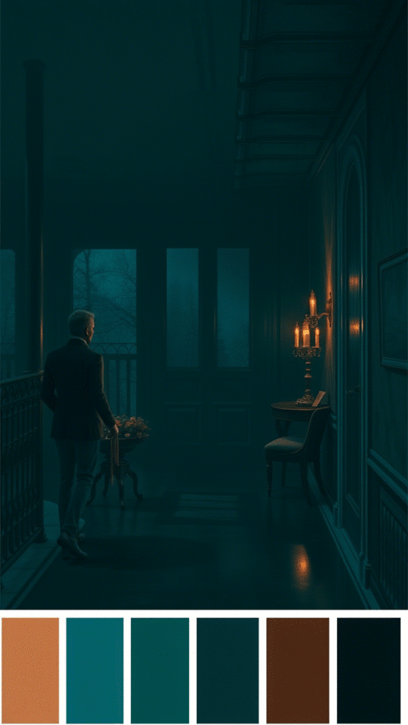
Teal on its own is already a showstopper. But pair it with copper accents, and you’re in seriously stylish territory. This combo feels luxe, like a hidden speakeasy or a swanky hotel bar.
Paint one wall teal if you’re feeling brave. Or just use it in accessories—pillows, curtains, a velvet chair if you’re feeling fancy. The copper can come through in lighting, frames, vases. Just little hits of it.
Fair warning: teal can be intense. So balance it with plenty of light—natural or artificial. Otherwise, it might feel a bit too heavy.
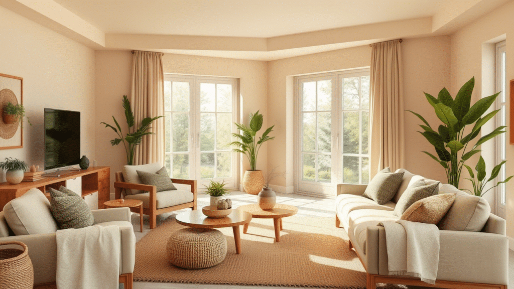
Cream and Sage: Light and Earthy
If black and white is too bold for you, cream and sage green might be more your speed. It’s soft. It’s inviting. It kinda whispers, rather than shouts.
Cream keeps the space bright, while sage brings in that earthy, natural feel. Together, they create this gentle harmony that’s easy on the eyes. Add in some natural textures—wicker, rattan, wool—and the room feels like a little slice of peace.
Honestly, this combo is great if you want your living room to be the chill zone. The kind of place where you can kick off your shoes, curl up with a book, and not move for hours.
Terracotta and Off-White: Warm and Inviting
There’s something about terracotta that just feels like home. Maybe it’s the earthy tone, maybe it’s that sun-baked warmth. Pair it with off-white, and you’ve got a combo that’s both cozy and fresh.
Terracotta works well in soft furnishings—cushions, rugs, throws. Or go big and paint a feature wall. Off-white balances it out, keeps things from feeling too heavy. Together, they create a space that feels grounded but still airy.
Oh, and bonus: this combo looks amazing with greenery. A few big leafy plants, and you’re golden.
Emerald and Gold: Luxe and Glamorous
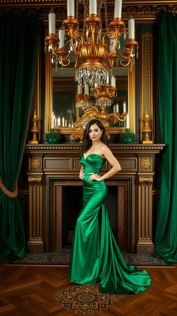
Emerald green is a bit of a show-off, let’s be real. But in the best possible way. It’s rich, it’s bold, it’s confident. Pair it with gold accents, and your living room instantly feels more expensive.
This combo works great if you’re going for a luxe vibe. Think velvet cushions, gold-framed mirrors, maybe even a statement chandelier if you’re feeling extra. Just don’t go overboard—let the green and gold be the stars, and keep everything else pretty simple.
One little tip: emerald looks fab against darker woods. So if you’ve got walnut or mahogany furniture, you’re already halfway there.
Soft Blue and Warm White: Fresh and Breezy
Soft blue and warm white is like a breath of fresh air. It’s light, it’s breezy, it’s cheerful without being in-your-face. Perfect for smaller spaces or rooms that don’t get a ton of light.
The blue brings in that cool, calming vibe, while the warm white keeps things from feeling too chilly. It’s a combo that just works, no matter your style. Coastal? Yep. Modern? Sure. Traditional? Absolutely.
Add some natural textures—cotton, jute, maybe some light wood—and the space feels relaxed and easy. The kind of room where you wanna kick back with a coffee and just be.
Mocha and Cream: Understated Elegance
Mocha and cream is the ultimate in understated style. It’s warm. It’s inviting. It’s the kind of combo that feels timeless, no matter how trends change.
The mocha adds richness, a bit of depth. Cream keeps things light, prevents the space from feeling too dark. Together, they create a palette that’s both cozy and sophisticated.
You can dress it up or down, too. Want it modern? Go for clean lines and minimal accessories. Prefer a more traditional look? Add in some classic patterns—maybe a subtle stripe or a soft floral.
Lavender and Soft Gray: Unexpectedly Chic
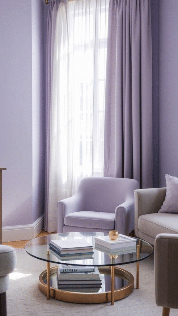
Lavender isn’t a color most folks think of for living rooms. But pair it with soft gray, and you’ve got a combo that’s fresh, unique, and actually pretty chic.
The key is to keep both tones muted. Nothing too bright or loud. The gray grounds the lavender, keeps it from feeling too sweet. The lavender, in turn, adds a soft touch of color that feels fresh and different.
It’s a great combo if you want something a little unexpected but still totally livable. Add in silver or glass accents to keep it feeling light and airy.
Final Thoughts on Color Combos
At the end of the day, your living room color scheme should feel like you. Not just what’s trendy. Not just what looks good on Instagram. But what makes you feel happy, comfortable, at home.
Try samples. Play around. See how the light hits at different times of day. And most importantly—don’t be afraid to break the so-called “rules.” Sometimes, the best combos are the ones you make up yourself.
Because let’s face it—color is personal. And your living room? That’s your stage. Your sanctuary. Your little world. So go ahead, paint it in your colors.