In the heart of every home lies the kitchen—a space where culinary creativity meets family gatherings, where morning coffees are savored and evening meals are shared. Yet many homeowners underestimate just how dramatically the right color palette can revolutionize this vital space. A thoughtfully chosen kitchen color scheme doesnt merely please the eye; it fundamentally transforms how the room feels, functions, and flows with the rest of your home.
“Color is the single most impactful design element in a kitchen renovation,” notes Emma Richardson, interior designer with over 15 years specializing in kitchen transformations. “More than expensive appliances or exotic countertops, your color choices will define the space’s personality.”
Whether you’re planning a complete renovation or simply looking to refresh your current space, the perfect color combination can breathe new life into your kitchen without breaking the bank. From timeless classics to bold contemporary choices, we’ve curated 20 inspiring kitchen color schemes that balance aesthetic appeal with practical considerations—each capable of transforming your kitchen from merely functional to absolutely fabulous.
Understanding Kitchen Color Psychology

Before diving into specific color schemes, it’s worth understanding how different colors affect not just the look of your kitchen but also how you feel when spending time there. Color psychology plays a surprisingly significant role in kitchen environments, where both food preparation and social interaction occur.
Studies from the Journal of Environmental Psychology suggest that colors don’t just impact mood—they can actually influence appetite and food perception. Warm colors like red and orange have been shown to stimulate appetite and encourage conversation, making them popular choices for dining areas. Meanwhile, cooler blues and greens tend to suppress hunger but promote calm and clarity—potentially helpful when preparing complex meals.
Research conducted by the Color Association of the United States reveals that our perception of temperature is also affected by color choices. Kitchens with predominantly cool colors (blues, greens, purples) can actually feel up to 3-4 degrees cooler than identical rooms painted in warm tones (reds, oranges, yellows).
Beyond mood and temperature, colors dramatically affect our perception of space. Designer Kate Williams explains, “Light colors recede from the eye, making spaces feel larger and more airy, while dark colors advance toward the eye, creating coziness but potentially making smaller kitchens feel cramped if overused.”
Factors to Consider Before Choosing Your Kitchen Color Scheme

Selecting the perfect kitchen color scheme isn’t just about following trends or personal preference—though both certainly matter. Several practical factors should guide your decision:
Natural Light Assessment: Kitchens with abundant natural light can support a wider range of color options, including darker tones. North-facing kitchens receive cooler, bluish light that can make cool colors appear more intense and warm colors somewhat muted. South-facing kitchens enjoy warm, yellowish light throughout the day, enhancing warm colors and softening cool ones.
Space Dimensions: Compact kitchens generally benefit from lighter colors that create an illusion of spaciousness, while larger kitchens can comfortably accommodate darker or more dramatic color schemes without feeling cramped.
Existing Elements: Unless you’re replacing everything, your color scheme needs to harmonize with existing fixtures, flooring, and architectural features. Natural stone countertops, for example, often contain undertones that should be acknowledged in your color selections.
Adjacent Spaces: Today’s open-concept homes demand cohesive color flow between rooms. Your kitchen color scheme should complement—not clash with—neighboring living spaces.
Longevity Considerations: While trendy colors might seem appealing now, remember that kitchen renovations represent significant investments. Designer Michael Torres advises, “Choose a scheme you’ll still love five years from now—trends come and go, but you’ll be living with your kitchen daily.”
With these considerations in mind, let’s explore 20 inspiring kitchen color schemes that combine aesthetic appeal with practical application.
Classic White Kitchen Color Scheme

The enduring popularity of white kitchens isn’t merely trend-driven—it’s rooted in the color’s unmatched versatility and timeless appeal. According to the National Kitchen and Bath Association’s annual trend report, white continues to dominate kitchen color preferences, with over 67% of designers reporting it as their clients’ first choice.
Modern interpretations of white kitchens have evolved far beyond the sterile, clinical look once associated with all-white spaces. Today’s white kitchens incorporate subtle variations in tone and texture to create dimension and warmth. Designers frequently mix bright white cabinetry with soft cream walls or layer different white finishes—matte, glossy, textured—to create visual interest without introducing additional colors.
“The key to a successful white kitchen is understanding that ‘white’ isn’t just one color,” explains designer Sophia Chen. “It’s a spectrum ranging from stark whites to creamy off-whites, each with unique undertones that should be considered holistically.”
To prevent white kitchens from feeling cold or sterile, strategic accent incorporation proves essential. Natural wood elements—exposed beams, butcher block countertops, or floating shelves—add organic warmth, while metallics like brass or copper hardware introduce sophistication and depth. Even small colorful elements like a vibrant stand mixer or art piece can serve as focal points against the neutral backdrop.
Maintenance considerations should factor into your decision-making process as well. While white kitchens create an impression of cleanliness, they also show dirt, grease, and wear more readily than darker alternatives. Advances in material technology have partly addressed this concern—many modern white finishes now feature smudge-resistant and easy-clean properties.
Modern Gray Kitchen Color Scheme

Gray kitchens have steadily risen in popularity, offering sophisticated neutrality with greater depth and forgiveness than their white counterparts. What makes gray particularly versatile is its chameleon-like ability to shift appearance based on undertones and surrounding elements.
When selecting gray for your kitchen, understanding undertones becomes crucial. Warm grays (with beige, yellow, or red undertones) create cozier environments that pair beautifully with wood elements, while cool grays (with blue or green undertones) offer a more contemporary, crisp appearance that complements stainless steel and chrome finishes.
Celebrity designer Nate Berkus notes, “Gray isn’t a compromise between black and white—it’s a sophisticated choice in its own right, offering subtle richness that evolves throughout the day as lighting changes.”
To prevent gray kitchens from appearing flat or industrial, texture variation becomes essential. Consider incorporating mixed materials like concrete countertops with velvet barstools, or matte cabinet finishes alongside reflective backsplash tiles. Pattern introduction through textiles, backsplashes, or even cabinet detailing can further enliven gray spaces.
According to kitchen industry data, charcoal gray cabinetry paired with lighter gray walls has seen a 45% increase in popularity over the past three years, particularly in urban environments where sophisticated, low-maintenance aesthetics are highly valued.
Bold Black and White Kitchen Color Combination

The dramatic pairing of black and white creates one of the most eye-catching kitchen color schemes—a high-contrast combination that never truly goes out of style. This classic duo offers remarkable versatility, adapting to both ultra-modern and traditional kitchen designs depending on application and accessories.
Finding the right balance proves crucial when working with such strong contrasts. Designers typically recommend following the 70/30 rule, where approximately 70% of the space features the dominant color (usually white) and 30% incorporates the accent color (black). This prevents either color from overwhelming the space while maintaining visual impact.
Breaking up the starkness of a black and white palette requires thoughtful texture incorporation. Consider white subway tiles with dark grout, veined marble countertops, or textured black cabinet fronts that add dimensional interest. Material mixing—like matte black cabinetry with glossy white backsplash tiles—creates additional layers of visual complexity.
Lighting deserves special attention in black and white kitchens, as dark elements absorb rather than reflect light. Strategic placement of under-cabinet lighting, pendants, and recessed fixtures can prevent dark areas from becoming black holes while highlighting the crispness of white elements.
Design director Emma Sims-Hilditch shares, “Black and white kitchens provide the perfect neutral foundation for introducing personality through changeable elements like artwork, textiles, or seasonal accessories—making them remarkably adaptable over time.”
Elegant Navy and White Kitchen Color Scheme

Navy blue has emerged as the new neutral in kitchen design, offering depth and sophistication without the starkness of black. When paired with white, navy creates a refined, timeless aesthetic that references both nautical traditions and classic European design sensibilities.
Application strategy significantly impacts the final appearance of navy and white kitchens. Upper cabinets in white with navy base cabinets creates an airy feeling while anchoring the space; the reverse (navy uppers, white lowers) makes a more dramatic statement while keeping workspaces bright. Some homeowners opt for all-navy cabinetry with white walls and countertops, creating a furniture-like appearance that’s particularly effective in open-concept spaces.
Hardware selection becomes particularly important in navy kitchens, as metallics stand out dramatically against the deep background. Brass and gold finishes create warm, elegant contrast, while chrome and nickel offer a more contemporary, crisp appearance. Mixed metals—though requiring careful curation—can add sophisticated dimension when executed thoughtfully.
“Navy functions almost like denim in fashion,” observes kitchen designer Caroline Beaumarchais. “It pairs with virtually everything while offering more character than most neutrals. It’s simultaneously classic and current.”
For smaller kitchens considering navy, strategic application prevents overwhelming the space. Navy island cabinetry against otherwise white surroundings, for example, creates a focal point without diminishing spatial perception. Similarly, navy as an accent wall color rather than cabinetry color offers impact without commitment.
Timeless Beige and Cream Kitchen Colors

Beige and cream kitchens have undergone a significant renaissance, shedding their “boring” reputation to emerge as sophisticated alternatives to stark white. These warm neutrals create inherently welcoming environments that reference natural materials and traditional design sensibilities while feeling thoroughly contemporary.
The key to successful beige and cream kitchens lies in layering multiple tones within the same color family rather than settling on a single shade. Designer Jean Stoffer recommends “creating depth through subtle variations—perhaps cream cabinetry, slightly darker beige walls, and taupe accents—building a richly textured environment without introducing contrasting colors.”
Material selection becomes particularly important when working with neutral palettes. Natural stone countertops with warm veining, textured backsplash tiles, woven natural fiber elements, and mixed metals all contribute dimensional interest that prevents beige spaces from falling flat.
According to kitchen industry statistics, cream-colored cabinetry has seen a 28% increase in specification among luxury kitchen renovations since 2022, indicating renewed appreciation for these warm neutrals among design-conscious homeowners.
Architectural details shine particularly well in beige and cream environments, where subtle shadows and highlights aren’t overwhelmed by strong colors. Consider adding coffered ceilings, crown molding, cabinet detailing, or paneling to create architectural interest that complements the subtlety of the color scheme.
Soft Pastel Kitchen Color Scheme

Pastel kitchens have evolved dramatically from their 1950s predecessors, offering sophisticated softness that brings gentle color to contemporary spaces. Modern pastel applications favor muted, complex tones with gray or neutral undertones rather than candy-bright iterations.
Strategic placement determines whether pastels read as whimsical or refined. Full pastel cabinetry makes a stronger statement, while limiting pastels to a kitchen island or upper cabinets creates more subtle impact. Pairing pastel elements with crisp white, natural wood, or even black accents helps anchor these lighter hues and prevents them from reading as juvenile.
Designer Emma Henderson notes, “Today’s pastels aren’t your grandmother’s kitchen colors. They’re sophisticated, nuanced shades that bring personality without overwhelming the space—think sage green rather than mint, blush rather than pink, sky rather than baby blue.”
Material pairings dramatically affect how pastels are perceived. Contemporary applications often combine pastel cabinetry with industrial elements like concrete countertops or matte black fixtures to create tension between softness and structure. This juxtaposition helps pastels read as intentional design choices rather than dated references.
Interestingly, data from psychology studies suggests that soft blue and green pastels may actually make food taste sweeter—one reason these particular pastel tones have enjoyed enduring popularity in kitchen environments across cultures and time periods.
Sophisticated Black and Gold Kitchen Colors

Few color combinations communicate luxury as effectively as black and gold—a pairing that references both art deco glamour and contemporary opulence. This dramatic duo creates unmistakable visual impact while offering surprising versatility when thoughtfully applied.
Successful black and gold kitchens rely on careful proportion management. Most designers recommend limiting gold to 10-15% of the visual field, allowing it to punctuate rather than compete with the sophisticated darkness of black elements. Common applications include gold hardware against black cabinetry, gold-toned faucets, statement lighting fixtures, or subtle gold veining in natural stone surfaces.
Material selection significantly impacts how these colors are perceived. Matte black cabinetry creates a more contemporary, subtle foundation than high-gloss finishes, which deliver drama but show fingerprints more readily. Similarly, brushed gold elements offer sophisticated warmth with practical durability, while polished gold finishes provide maximum glamour but require more maintenance.
“Black and gold kitchens aren’t just about making a statement—they’re about creating a mood,” explains designer Marcus Bell. “When executed with restraint, this combination evokes sophistication without ostentation, drawing on historical references while feeling thoroughly current.”
Lighting design becomes particularly crucial in black-dominant kitchens. Strategic placement of ambient, task, and accent lighting ensures dark surfaces don’t absorb too much light while allowing gold elements to achieve their full reflective potential. Statement fixtures in gold—whether pendant lights over an island or a sculptural chandelier—often serve as jewelry-like focal points in these elegant spaces.
Natural Green and Wood Kitchen Color Scheme

The combination of green and wood tones creates kitchens with unmistakable biophilic qualities—spaces that reference nature and promote wellbeing through color psychology. According to a 2023 study published in the Journal of Environmental Psychology, green kitchens were associated with higher reported levels of relaxation and creative thinking compared to other color schemes.
When selecting green for kitchen applications, undertone consideration becomes essential. Yellow-greens (like olive or sage) create warmer, more traditional environments that pair beautifully with medium-toned woods. Blue-greens (like emerald or teal) offer more dramatic, jewel-toned spaces that contrast strikingly with both light and dark wood finishes.
“Green represents the perfect middle ground between stimulating and calming colors,” notes color psychologist Dr. Anita Wells. “In kitchen environments, it promotes focus without overstimulation—ideal for both food preparation and social interaction.”
Wood selection should complement rather than match green tones. Designer Jordan Harris recommends “creating pleasing contrast rather than perfect coordination—perhaps sage green cabinetry with walnut accents, or emerald green with blond oak elements.” This natural variation references the diversity found in outdoor environments.
Accessorizing green and wood kitchens benefits from bringing actual plant life into the space, creating visual connection between color scheme and natural elements. Studies indicate that kitchens with live plants are perceived as more inviting and relaxing than those without, regardless of color scheme.
Bright Yellow and White Kitchen Color Combination

Yellow and white kitchens harness the psychological power of the most luminous color in the spectrum—one associated with optimism, energy, and warmth across cultures. According to color psychology research, yellow stimulates mental activity and promotes conversation, making it particularly suitable for kitchens that double as gathering spaces.
Application strategy dramatically influences how yellow is perceived in kitchen environments. Designer Raquel Martinez advises, “Yellow packs tremendous visual punch—a little goes a long way. Consider using it as an accent rather than a dominant color, perhaps on a single wall, the interior of glass-front cabinets, or kitchen island cabinetry.”
Shade selection significantly impacts yellow’s effect. Buttercream and pale yellows create soft, welcoming environments suitable for traditional aesthetics, while mustard and amber yellows offer sophisticated mid-century references. Bright, primary yellows deliver contemporary energy but require careful balancing to prevent visual overwhelm.
Natural light interaction dramatically affects yellow spaces. North-facing kitchens benefit from warmer, golden yellows that counteract cool light, while south-facing kitchens can support the full yellow spectrum, from pale butter to rich ochre. In artificially lit spaces, yellow walls can reflect light to create a permanently sunny atmosphere regardless of exterior conditions.
Designer Timothy Corrigan notes, “Yellow and white kitchens possess remarkable emotional resonance—they simply make people happy. Even the most minimalist, contemporary interpretation of this pairing carries inherent warmth that more neutral schemes must work harder to achieve.”
Cool Blue and Gray Kitchen Color Scheme
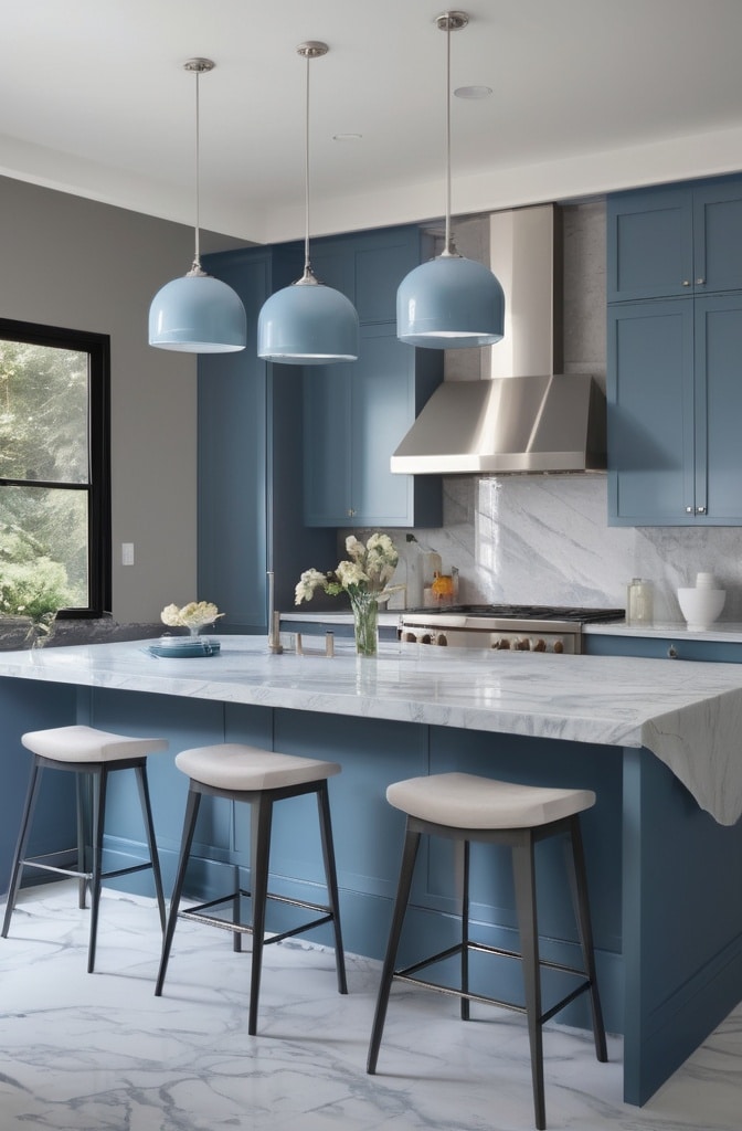
The pairing of blue and gray creates kitchens with remarkable visual stability—spaces that feel simultaneously cool and calming while offering sophisticated depth. This combination references both natural elements (sky, water, stone) and architectural traditions, explaining its enduring appeal across design styles.
Finding the right blue-gray balance depends largely on the kitchen’s intended mood. Blue-dominant schemes with gray accents create more dynamic, distinctive spaces, while gray-dominant schemes with blue elements offer more subtle, neutral environments. Either approach benefits from incorporating white elements that provide brightness and prevent heaviness.
Material selection significantly impacts blue and gray kitchens’ appearance. Designer Elise Harper recommends “incorporating natural materials like marble, limestone, or light woods to prevent excessive coolness. These organic elements add necessary warmth while maintaining the palette’s sophisticated restraint.”
“Blue-gray kitchens possess remarkable temporal flexibility,” observes architectural color consultant Benjamin Mills. “They appear different throughout the day as lighting conditions change, revealing subtle undertones that create visual interest without requiring additional colors or patterns.”
Coastal influences often inform blue and gray kitchens, but contemporary interpretations avoid literal nautical references in favor of sophisticated abstraction. Think complex slate blues rather than primary blues, and dimensional grays rather than flat alternatives. This nuanced approach references maritime traditions without resorting to themed decoration.
Rustic Brown and Earth Tones for Kitchens

Kitchens featuring brown and earth tone palettes create instant warmth while referencing natural materials—a combination that feels simultaneously grounding and inviting. These organic color schemes connect to historical architectural traditions while adapting beautifully to contemporary lifestyles.
Modern applications of rustic color schemes have evolved far beyond the heavy, dark treatments once associated with traditional design. Today’s earth-toned kitchens incorporate varied brown tones from light taupe to rich chestnut, often layered against creamy whites or soft greiges that prevent heaviness.
“The key to contemporary rustic kitchens lies in lightening and brightening the traditional palette,” explains designer Rosa Beltran. “We maintain the warmth of earth tones but apply them with a lighter touch—perhaps medium-brown lower cabinets with creamy upper cabinets, rather than dark wood throughout.”
Material authenticity plays a crucial role in successful earth-toned kitchens. Real wood (rather than simulated grain), natural stone (rather than printed alternatives), and handcrafted elements all contribute to the organic authenticity that makes these spaces successful. These authentic materials bring inherent variation that creates visual richness without requiring additional colors.
According to kitchen industry research, brown kitchen cabinetry has seen a 34% increase in specification since 2022, indicating renewed appreciation for warmer, more natural color schemes following years of gray and white dominance in kitchen design.
Dramatic Red and Black Kitchen Color Scheme

Red and black create perhaps the most dramatic kitchen color pairing possible—a bold combination that simultaneously references classic Asian design traditions and contemporary European aesthetics. This high-contrast scheme demands confident application but rewards with unmistakable visual impact.
Strategic use becomes essential with such powerful colors. Most designers recommend limiting red to approximately 30% of the visual field, using it for accent walls, island cabinetry, or statement appliances rather than throughout the space. Black provides sophisticated grounding that prevents red from feeling overly energetic or overwhelming.
Cultural influences often inform red and black kitchens, from traditional Chinese design (where red symbolizes good fortune) to Italian modernism (where red represents passion and black represents sophistication). These cultural references can be subtle or overt depending on accessory and material choices.
“Red stimulates appetite and conversation—two qualities perfectly suited to kitchen environments,” notes color psychologist Dr. Martin Chen. “When balanced with black’s grounding presence, red becomes sophisticated rather than overwhelming, energizing without being chaotic.”
Different red undertones create distinctly different environments. Blue-reds (like burgundy or wine) pair with black to create moody, intimate spaces, while orange-reds (like poppy or vermillion) create more energetic, contemporary pairings. The specific red selected dramatically influences the kitchen’s ultimate character.
Neutral Gray and White Kitchen Color Scheme

The combination of gray and white creates kitchens of remarkable versatility—spaces that provide neutral backgrounds for both contemporary and traditional design elements while offering more depth than all-white alternatives. This pairing has dominated kitchen design for nearly a decade, evolving through various interpretations without losing relevance.
Creating interest within this neutral palette requires thoughtful texture and material variation. Designer Kate Henderson recommends “incorporating at least three distinct textures—perhaps honed stone countertops, matte cabinetry, and glossy backsplash tiles—to create dimensional interest that prevents visual flatness.”
Accent color integration—through accessories, artwork, or small appliances—allows gray and white kitchens to evolve seasonally without permanent commitment. This adaptability explains the scheme’s enduring popularity among homeowners seeking longevity from their kitchen investments.
“Gray and white kitchens function almost like perfect canvases,” explains designer Thomas Reynolds. “They accommodate virtually any accent color, work with every metal finish, and support both traditional and contemporary architectural details without conflict.”
Lighting design deserves particular attention in gray and white kitchens, as these neutral tones reflect and respond dramatically to different light qualities. Cool LED lighting emphasizes crispness and modernity, while warmer light sources bring out subtle undertones in gray elements, creating perceptually warmer environments.
Warm Terracotta and Beige Kitchen Colors
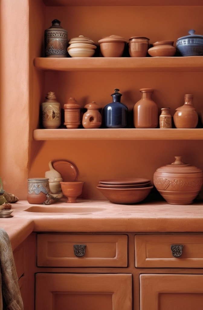
The combination of terracotta and beige creates kitchens with unmistakable warmth and earthiness—spaces that reference Mediterranean, Southwestern, and colonial design traditions while feeling thoroughly contemporary when thoughtfully applied.
Modern interpretations of terracotta kitchens have evolved significantly from their 1980s predecessors. Today’s applications favor softer, more muted terracotta tones paired with warm beiges and creams rather than stark whites. This nuanced approach references traditional design while feeling fresh and current.
“Terracotta contains inherent warmth that conventional paints struggle to replicate,” notes architectural color specialist Maria Killam. “It carries subtle color variation that creates instant depth and character—qualities particularly valuable in new construction that lacks inherent architectural history.”
Material authenticity significantly impacts terracotta kitchens’ success. Natural clay tiles, textured plaster finishes, handmade ceramics, and other artisanal elements reinforce the organic, handcrafted quality central to this aesthetic. These elements bring subtle color variation that creates visual richness without requiring additional hues.
Interestingly, hospitality design research indicates that restaurants utilizing terracotta color schemes report longer average dining times and higher dessert orders—suggesting these warm tones promote relaxation and lingering, qualities equally valuable in residential kitchen environments.
Classic Black and Stainless Steel Kitchen Scheme

The pairing of black and stainless steel creates kitchens with unmistakable contemporary edge—spaces that reference both industrial design traditions and high-end professional kitchens. This dramatic combination offers sophisticated contrast while maintaining remarkable neutrality.
Creating warmth within this inherently cool palette requires thoughtful material integration. Designer Jason Wu recommends “incorporating warm-toned woods, textured natural stone, or even leather upholstery to soften the potential severity of black and steel. These organic elements create necessary balance without compromising the scheme’s contemporary character.”
Balance considerations become particularly important in black-dominant kitchens. For smaller spaces, limiting black to lower cabinetry while keeping upper elements lighter prevents overwhelming darkness. In larger kitchens, black can successfully extend throughout the space when broken by reflective stainless elements and adequate lighting.
“Black and stainless steel kitchens communicate unmistakable confidence,” observes designer Natasha Liu. “They reference professional culinary environments while offering remarkable design longevity—these aren’t colors that will look dated in five years.”
Lighting design significantly impacts black and stainless kitchens’ functionality. Because dark surfaces absorb rather than reflect light, generous ambient lighting combined with targeted task lighting prevents shadows from compromising workspaces. Dramatic accent lighting can highlight stainless elements’ reflective qualities, creating visual dynamism.
Minimalist White and Light Wood Kitchen Colors

The combination of white and light wood creates kitchens with unmistakable Scandinavian influence—spaces that feel simultaneously bright, warm, and thoroughly contemporary. This pairing references Nordic design traditions while offering remarkable adaptability across architectural styles.
Creating interest within this relatively spare palette requires attention to subtle variation and textural contrast. Designer Erik Hansen recommends “mixing multiple white tones rather than selecting a single shade—perhaps soft white walls, bright white countertops, and warm white cabinetry—to create dimensional depth that prevents starkness.”
Wood selection significantly impacts these kitchens’ ultimate character. Pale oak and ash create authentic Scandinavian references with their minimal grain and neutral undertones, while maple and birch offer slightly warmer alternatives. The specific wood selected—and its finish—dramatically influences the space’s warmth and character.
“White and light wood kitchens excel in creating perceived spaciousness,” notes architect Sarah Jensen. “They visually recede rather than advance, making them particularly valuable for compact urban kitchens where maximizing spatial perception matters.”
Natural elements play crucial roles in preventing minimalist kitchens from feeling clinical. Living plants, textural textiles, handcrafted ceramics, and other organic accessories add necessary warmth and personality without compromising the clean aesthetic central to this design approach.
Emerging Kitchen Color Trends for 2025-2026

As we look toward future kitchen color trends, several clear directions have emerged from industry data, designer forecasts, and consumer preference studies. Understanding these emerging trends provides valuable context for making timeless yet current kitchen color decisions.
Data from the National Kitchen and Bath Association’s 2025 trend report indicates significant shifts toward warmer color palettes after years of cool neutrals dominance. Specifically, warm beiges, soft terracottas, and golden-toned woods have seen 43% increases in specification among designers working in luxury residential projects.
Regional variations in color preferences remain pronounced. Coastal areas continue favoring blues and whites with maritime references, while urban environments increasingly embrace dramatic dark palettes (black, navy, forest green) that reference historic architecture. Mountain and rural regions show renewed interest in earth tones and natural materials that connect to surrounding landscapes.
Sustainability considerations increasingly influence color and material choices. Biophilic color schemes—those referencing natural elements through greens, browns, and blues—have gained significant traction as research confirms their positive impact on occupant wellbeing. Similarly, materials with transparent sourcing and minimal processing increasingly influence color selections.
“We’re witnessing a marked shift toward personal expression rather than trend-following,” observes color forecaster Michelle Lamb. “Homeowners increasingly seek kitchens that reflect their unique personalities rather than replicating popular social media aesthetics—a maturation of the design conversation that prioritizes individuality over conformity.”
Practical Tips for Implementing Your Chosen Color Scheme

Translating inspiration into reality requires practical strategies that acknowledge both budget constraints and implementation challenges. Consider these approached for bringing your chosen color scheme to life:
Test Before Committing: Paint large sample boards (at least 24″x24″) with your chosen colors and observe them in your kitchen at different times of day. Colors appear dramatically different under varying light conditions, and this simple step prevents costly mistakes.
Start Small: If you’re hesitant about embracing color, begin with easily changeable elements like wall paint, window treatments, or accessories before committing to colored cabinetry or permanent fixtures. This phased approach allows experimentation with minimal financial risk.
Work with Existing Elements: Complete kitchen renovations represent significant investments. If working with some existing elements (like flooring or countertops), ensure your color scheme complements these permanent features rather than fighting against them.
Consider Long-Term Value: While personal expression matters, extremely unique or trendy color choices may impact resale value. If you anticipate selling within five years, moderate color choices may offer greater return on investment.
Consult Professionals When Needed: Professional color consultations typically cost between $150-$500—a relatively small investment compared to the cost of repainting or replacing cabinetry if colors don’t work as expected. For major renovations, this expertise provides valuable insurance against costly mistakes.
Conclusion
The kitchen truly stands as the heart of the home—a space where functionality meets personal expression, where family traditions are created and daily rhythms unfold. The color scheme you select for this vital space does far more than please the eye; it fundamentally shapes how the room feels, functions, and connects with your broader living environment.