Teal’s one of those magical hues. It sits between blue and green. It whispers “calm” and “bold” at the same time.
Teal’s versatile. It’s soothing. It’s vivid. But throw the wrong pairing at it and… uh oh. We’re going to dodge that.
Here are 26 surprising, charming, totally wearable combos. Each comes with a vibe note. No tacky here, promise.
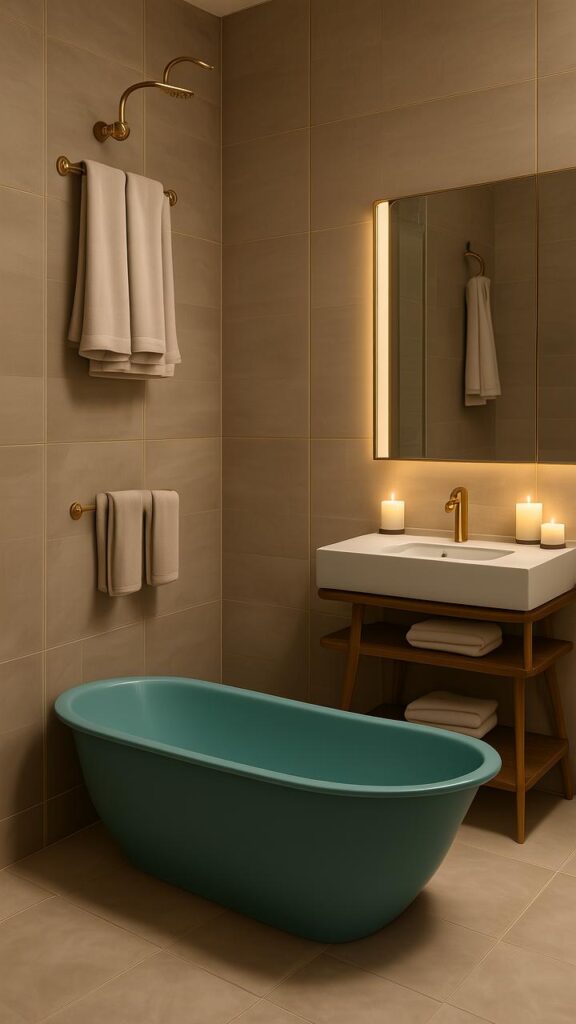
1. Teal + Crisp White
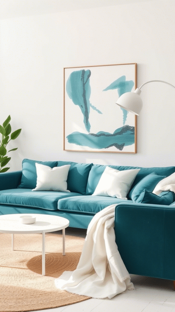
Bright contrast. Instant clean. It’s apple‑fresh.
Soft pillows, white walls, teal curtains. Feels like a deep breath.
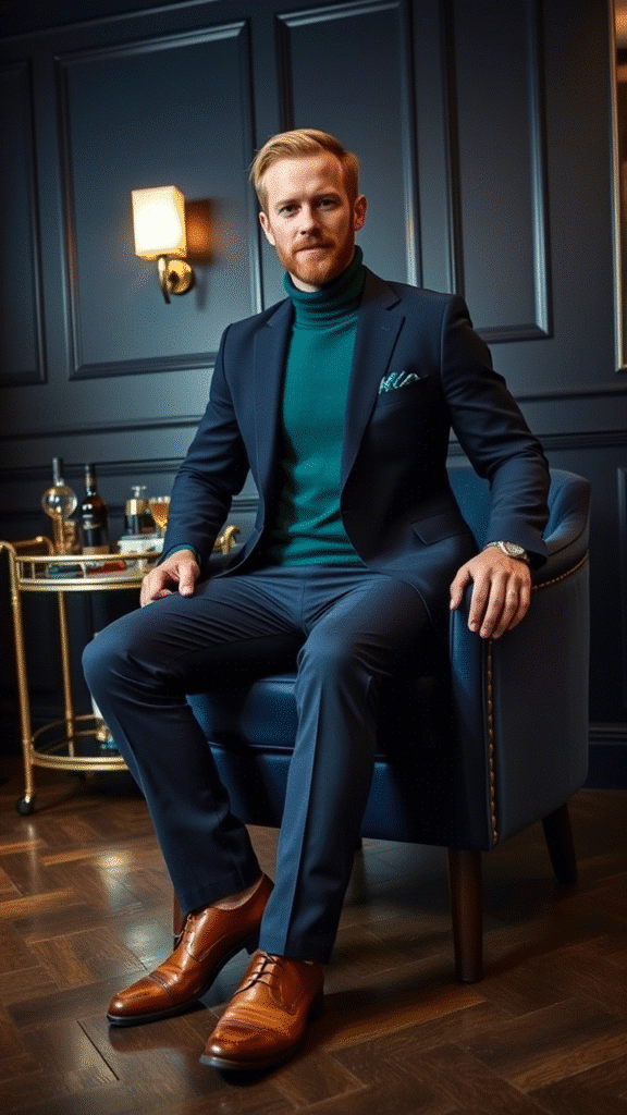
2. Teal + Charcoal Gray
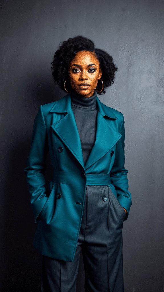
Sleek city‑chic. A bit mysterious.
Think sofas and industrial loft vibes.
3. Teal + Mustard Yellow
Retro wink. Warm pop.
It’s like vintage diner meets modern loft.
4. Teal + Soft Pink
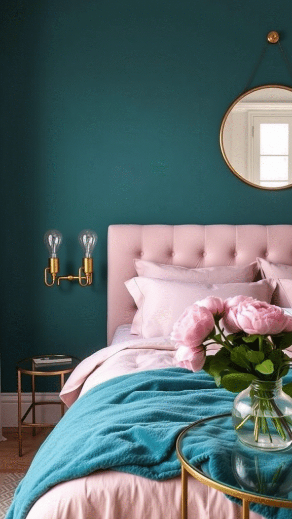
Sweet yet serene.
Like mint ice‑cream with strawberry swirl.
5. Teal + Cocoa Brown
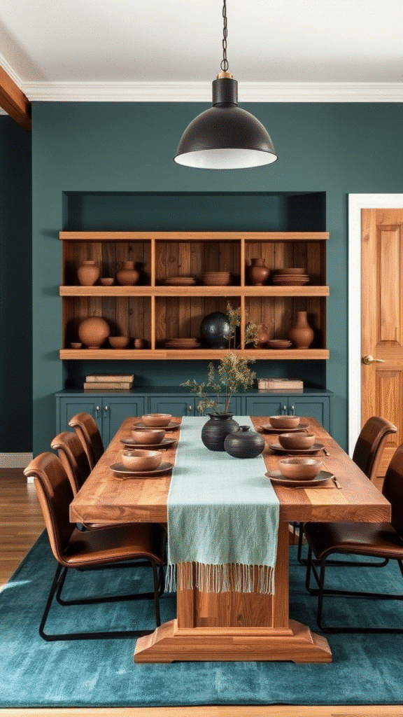
Earthy, calm, grounded.
Feels like pressed clay and glide‑on silk.
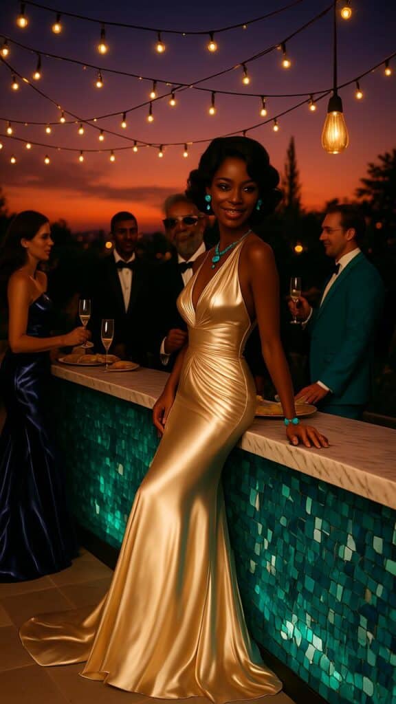
6. Teal + Gold Metallic
Rich, luxe, glamorous.
A teal velvet couch with brass legs? Yes pls.
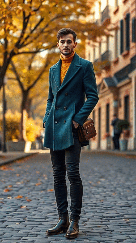
7. Teal + Navy Blue
Blue on teal. Unexpectedly bold.
Deep, layered, soothing.
8. Teal + Blush Coral

Next-level summer.
Like sunset on tropical beach.
9. Teal + Cream
Soft, creamy elegance.
Feels cozy, refined, chill.
10. Teal + Burnt Orange
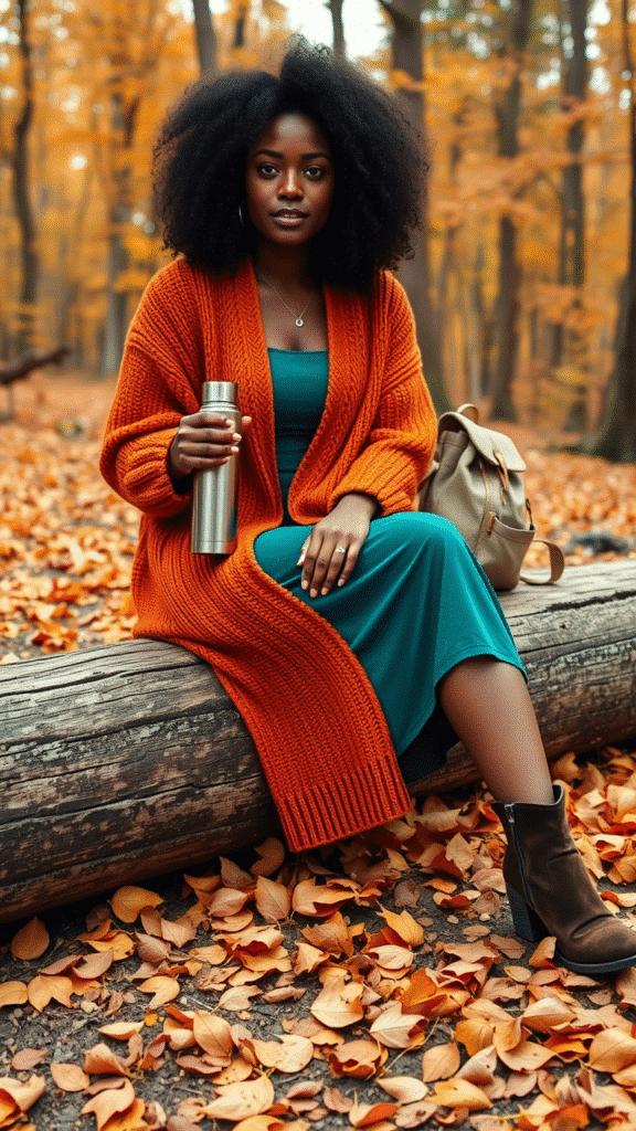
Deep autumn feel.
Like fall leaves with ocean background.
11. Teal + Lavender
Soft surreal pairing.
Dreamy and vintage.
12. Teal + Black
High‑contrast sculptural.
Daring, dramatic, museum‑worthy.
13. Teal + Olive Green
Natural, woodsy, botanical.
Feels like morning forest mist.
14. Teal + Raspberry Red

Bold statement. Juicy blast.
Electric energy. Feels alive.
15. Teal + Taupe
Understated, soft sophistication.
Feels of fine wool blanket.
16. Teal + Pale Yellow
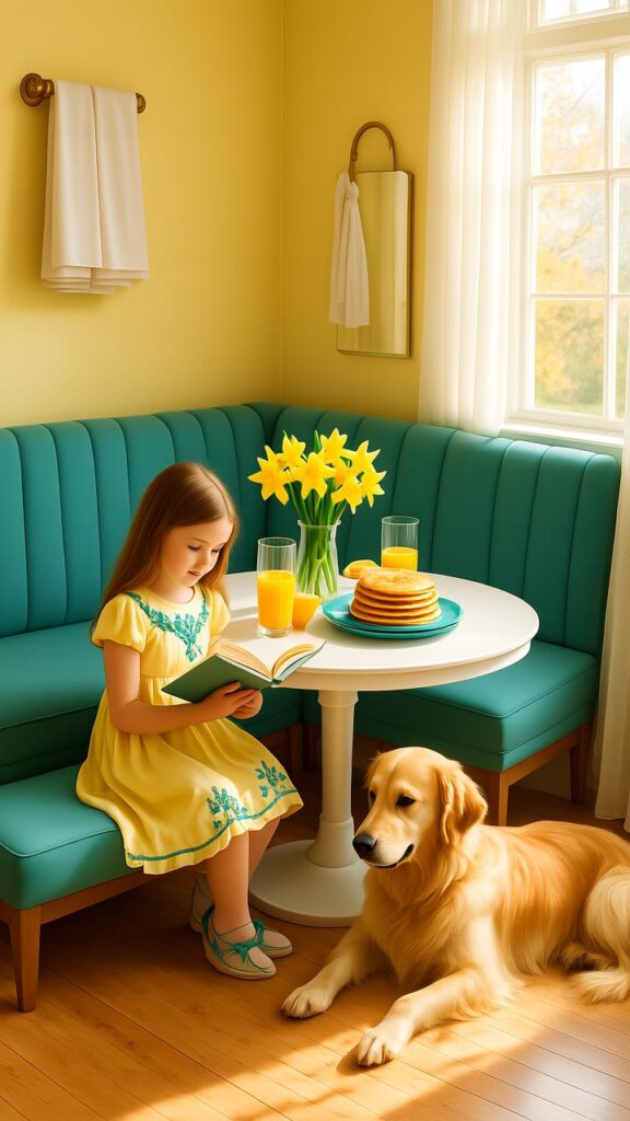
Light and citrusy.
Like sunshine through aqua glass.
17. Teal + Silver Metallic
Cool glam. Sleek, spacey aura.
Looks ultra‑modern.
18. Teal + Sand Beige
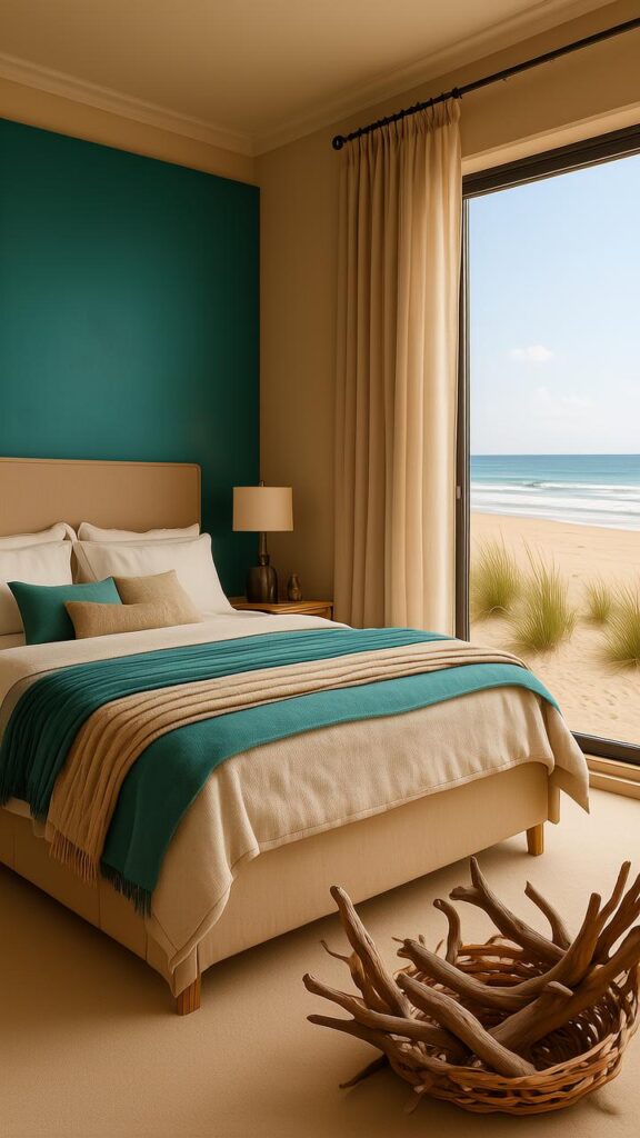
Beachy natural.
Feels like driftwood and shallow waves.
19. Teal + Maroon

Lux, intense, vintage glam.
Like plush velvet and aged leather.
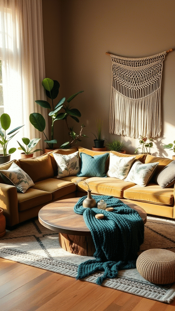
20. Teal + Mint Green
Soft analogous palette.
Feels fresh, calm, spa‑like.
21. Teal + Champagne
Elegant, celebratory.
It’s like bubbles in teal glass.
22. Teal + Peach

Soft, warm, delicate.
Tiny blush meets ocean tone.
23. Teal + Indigo
Rich fall‑in‑the‑sea vibe.
Deep, layered, enchanting.
24. Teal + Warm Gray
Balanced cool‑warm interplay.
Soft industrial nuance.
25. Teal + Slate Blue

Moody yet driven.
Like twilight on a lake.
26. Teal + Plum
Deep regal vibe.
Feels like velvet night sky.
Vibe Notes & Styling Tips
Every pairing has a personality.
Let’s unpack a few in playful detail.
How to Rock Teal + Mustard Yellow
These two are retro pals.
A mustard throw pillow on teal couch.
Add wood furnitures—oak, walnut.
It’s funky yet cozy. Don’t overdo yellow; one accent is all ya need.
Teal + Charcoal Gray – Urban Elegance
Gray walls, teal armchair, charcoal rug.
Metal‑leg tables, sleek lines.
This combo speaks minimalist but bold.
It says “I host stylish chats.”
Teal + Blush Coral – Summery Delight
Blush coral accents are subtle.
Try curtains, lamp shade, rug.
Teal walls, blush chairs.
It’s breezy, cheerful. Perfect for sunny spots.
Teal + Gold – Luxe Touch
Gold hardware, frames, lamps.
Even tiny gold flickers matter.
Pair with teal drapes or cushions.
It’s rich, but don’t glitz‑overload. More is less.
Teal + Burnt Orange – Cozy & Inviting
Burnt orange throws, cushions, art.
Teal walls or furniture.
This duo creates warmth and earthiness.
Perfect autumn nook vibe.
When to Use These Combos
Think room purpose.
Living room deserves drama; bedrooms need calm.
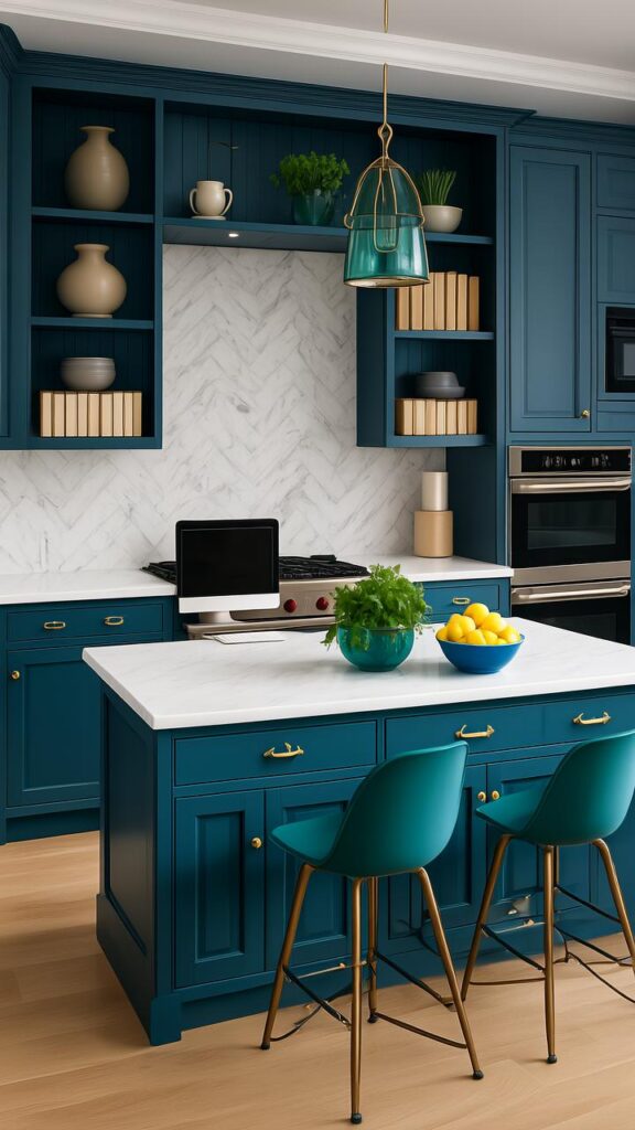
Kitchen? Teal + cream = kitchen freshness.
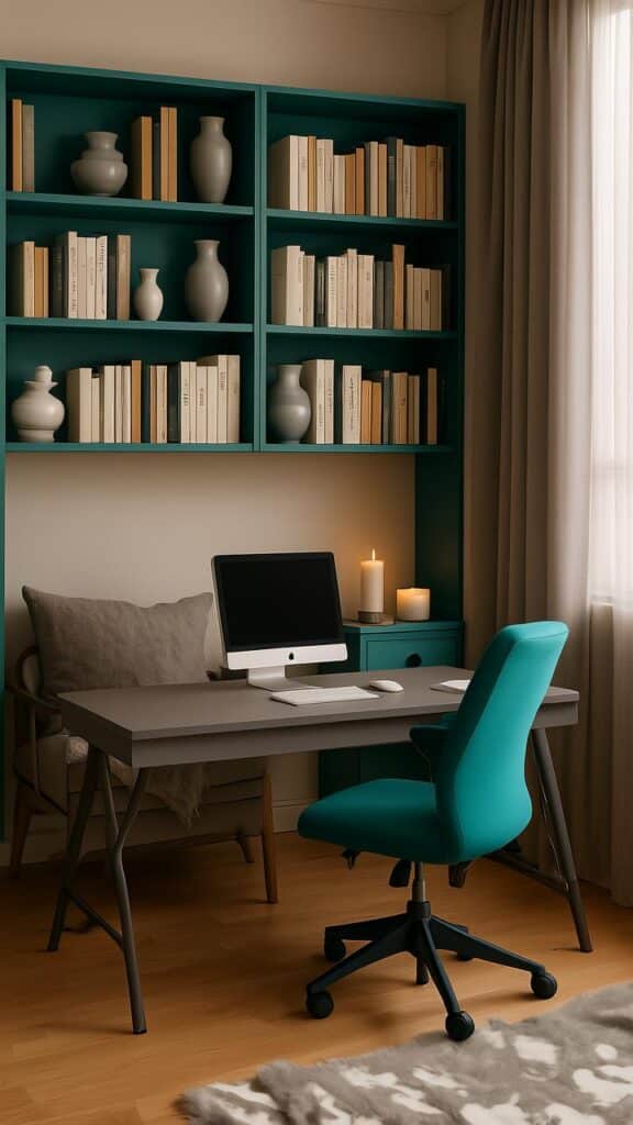
Office? Teal + navy = focused and calm.
Accessories matter.
Swapping rug or cushion is magical twist.
No need overhaul every time.
Texture matters too.
Velvet, silk, linen all shift mood.
Teal velvet + gold = luxe.
Teal linen + cream = breezy beach.
Color Psychology Quickie
Teal = balance.
Yellow = optimism.
Gray = calm.
Gold = luxury.
Orange = warmth.
Red = passion.
Mix wisely.
Like adding spices to your morning tea.
A dash goes far.
Decor Tips Without Overthinking
Tip 1: Use the 60‑30‑10 rule.
60% main color. 30% secondary. 10% accent highlight.
Tip 2: Add neutrals.
Cream, beige, gray—these soften bold combos.
Tip 3: Match finishes.
If you’ve shiny gold, avoid rusty brass.
Keeps look coherent.
Tip 4: Test swatches.
Teal paint looks different under daylight vs lamp.
Try before splashing walls.
Tip 5: Balance warm & cool undertones.
Teal can lean blue or greenish.
Pair warm (mustard, orange) if green‑leaning.
Pair cool (silver, lavender) if blue‑leaning.
Fun Combo Tables (Mini Quick Guide)
| Combo | Personality | Best Use |
|---|---|---|
| Teal + White | Fresh, Clean | Bathrooms, kitchens |
| Teal + Charcoal Gray | City‑sleek | Living, offices |
| Teal + Mustard + Wood | Retro cozy | Living rooms |
| Teal + Blush Coral | Soft summer | Bedrooms, lounge |
| Teal + Gold accents | Glamorous | Accent walls, cushions |
| Teal + Burnt Orange | Autumn warmth | Family room, library |
DIY & Small‑Scale Projects
1. Painted Frame Mat Board
Paint a thin strip of teal on frame edges.
Pair with blush coral prints. Easy, low‑commitment.
2. Cushion Covers
Change cushion covers seasonally.
Teal + mustard for fall, teal + blush for spring.
3. Vases & Décor Bowls
Teal ceramic vase on coffee table.
Add gold spray‑painted leaves.
4. Painted Furniture
Small table in teal, legs gold.
Wow factor.
Avoiding Tacky
- One loud color + one subtle accent
If mustard is bold, keep accessories quiet. - Limit patterns
Too many conflicting prints = visual noise. - Respect undertones
Don’t mix cool‑leaning teal with warm‑leaning coral willy‑nilly. - Mind your lighting
Bulbs change color vibes big time. - Balance intensity
All super‑vivid tones can become overwhelming.
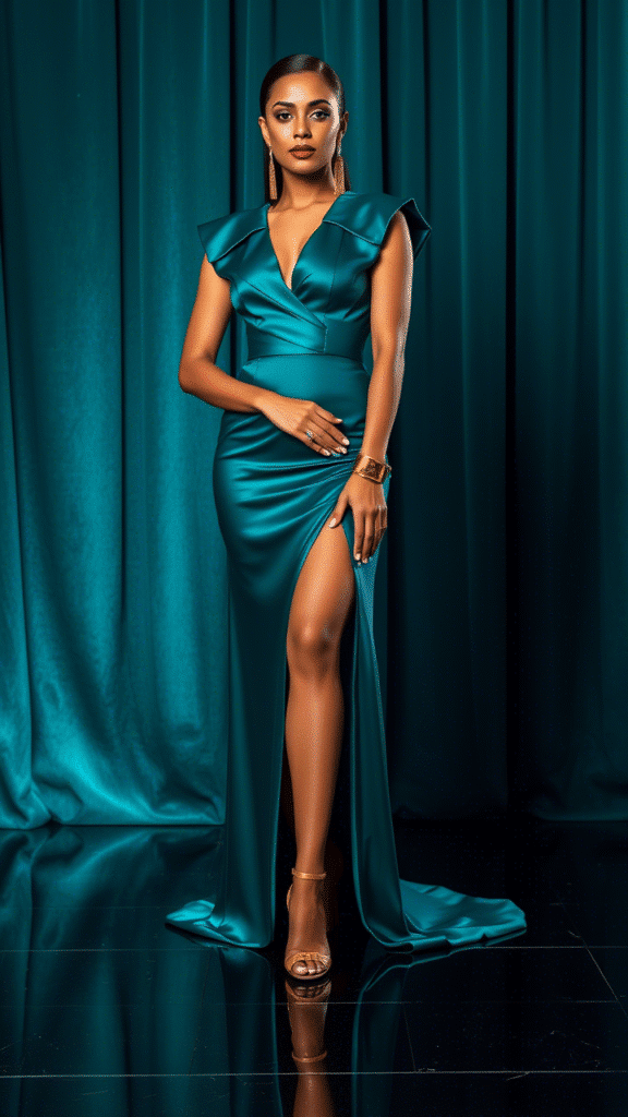
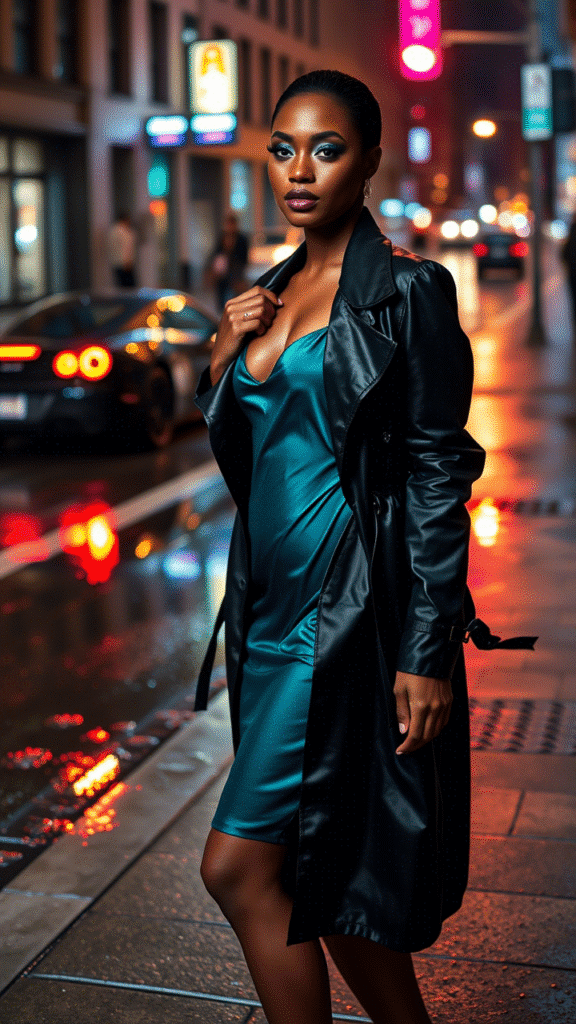
Teal Beyond Interiors
Fashion?
A teal dress with cream shoes.
Add gold jewelry. Stunning without over‑doing.
Tech gadgets?
Teal phone case + matte silver laptop skin = subtle pop.
Party decor?
Balloons, table covers—teal + blush coral + gold.
Festive but refined.
Playful Seasonal Setups
- Spring: Teal + pale yellow + mint
Light, fresh, floral accents. - Summer: Teal + blush coral + white
Beach, ice‑cream, bright breeze. - Fall: Teal + burnt orange + charcoal
Pumpkin spice, moody sunsets. - Winter: Teal + silver + navy
Cool elegance, hearth glow optional.
Why Teal Works Magic
It sits mid‑tone.
It combines cool & warm vibes.
It holds own in bold triads.
It’s surprisingly neutral in furniture world.
It’s adaptable.
Common Mistakes (and How to Fix)
Mistake: Over‑saturating
– Too many bold colors = chaos.
Fix: Use solids. Add whites/neutrals.
Mistake: Wrong accent scaling
– Big bold pattern overshadowing small accent.
Fix: Adjust sizes: large motifs, micro accents.
Mistake: Ignoring undertones
– Teal looks “off” with warm muted palette.
Fix: Always sample swatches.
Final Color Pairing Picks
- Teal + Crisp White
- Teal + Charcoal Gray
- Teal + Mustard Yellow
- Teal + Soft Pink (blush coral)
- Teal + Cocoa Brown
- Teal + Gold Metallic
- Teal + Navy Blue
- Teal + Burnt Orange
- Teal + Cream
- Teal + Lavender
- Teal + Black
- Teal + Olive Green
- Teal + Raspberry Red
- Teal + Taupe
- Teal + Pale Yellow
- Teal + Silver
- Teal + Sand Beige
- Teal + Maroon
- Teal + Mint Green
- Teal + Champagne
- Teal + Peach
- Teal + Indigo
- Teal + Warm Gray
- Teal + Slate Blue
- Teal + Plum
(We snuck accents like raspberry, peach in there too!)
In Closing
Teal’s magic lies in its balance.
Pair with restraint, think of personality.
Use textures, neutrals, lighting.
Experiment.
Tweak.
Trust your instincts.
And always.
Always love the space you live in.
That’s your playful guide.
All 26 combos, tips, vibes.
Hope it sparks some inspiration.
If you try any, I wanna see pics!
Ask ChatGPT